With the advent of data-related technologies in the last decade, it has become common practice now for companies to use insights from data at the core of their decision making processes. Most businesses, and the organizations within, are data-driven now, at least to some extent. Customer service teams are no different. Support leaders need to constantly look at the data behind customer interactions to get the pulse on how their team is doing and decide on the best next actions to take: provide more training, hire more staff or provision intelligent agent assist apps. But do we always know how to interpret the data analysis correctly and cautiously, without jumping to conclusions too fast?
Meet Alex, an ambitious and dedicated Customer Support Manager looking after a team of 20 support agents in a mid-size SaaS company. One Thursday morning, while looking at the daily report, she notices a sudden increase in the percentage of tickets tagged with a particular product feature, representing customer complaints about that feature. There were 6 out of 60 (10%) tickets tagged yesterday, more than double of the 4% from the day before, with 2 tickets out of 50. Is this a real issue and should Alex alert the product team?
Next Monday, Alex is facing a similar question. While preparing the weekly report on customer satisfaction, she could see that Paul, the support team member recently hired, has a satisfaction score of 85%, with 18 tickets rated as ‘good’ by customers last week out of a total of 21 tickets that were rated. This is 11 percentage points lower than John, who got a satisfaction score of 96%, with 27 out of 28 tickets rated as ‘good’ by customers. Does it mean that Paul needs more help and coaching than John? Or is the difference simply random?
In this article series, I will explain how customer service leaders can extract reliable insights from CX data using the same statistical methods as those used by the scientific community to interpret the data analysis results in research studies.
But first of all, what is CX data and what is special about it?
CX data is sampled data
There are two kinds of data generated in most customer service organizations: operational data and experience data. The former is objective, inward-looking and reflects how your team is performing. You use it to calculate and report on operational KPIs such as Volume of tickets, Average Handle Time or First Contact Resolution. The latter is subjective, outward-looking and reveals how customers are experiencing your product or service. Examples include: survey responses (NPS, CSAT), customer complaints or feature requests.
There are many differences between these two types, but here I am going to focus on one particular characteristic which should be considered when analyzing CX data.
Operational data is complete data, available and collected for each customer interaction: ticket, chat or call. Any metric derived from operational data is calculated upon the entire set of interactions on a given period, so they reflect the whole set.
On the other hand, CX data is sampled data, collected from a subset (or sample) of the whole population of customers or interactions. The metrics calculated on CX data are accurately representing the sample (or subset), but not necessarily the entire population. Deciding whether these metrics reflect the entire population of customers or interactions is an assumption that needs to be rigorously verified.
Let’s revisit Alex’s situation above. The customer satisfaction ratings received by agents are a good example of sampled data, as only a subset (usually 10-20%) of the whole population of customers served by the team left a rating. Alex needs to decide whether the fact that Paul’s CSAT of 85% is lower than John’s 96% is representative for the entire set of customers who interacted with Paul and John, otherwise she might come to the wrong conclusion.
Statistical testing for CX data
Statistics offer a rigorous framework for analyzing sampled data, called hypothesis testing, allowing you to validate whether the results obtained from sampled data can be generalized to the entire population. These results represent your hypothesis. You test whether the results are true or not by figuring out the odds that they have happened by chance, or the probability they are simply random results. This is called the null hypothesis, which is the reverse (or negation) of your original hypothesis.
Back to our example, Alex would like to validate whether Paul’s customers are indeed less satisfied with the outcome than John’s customers. That is her hypothesis. In order to do so, she needs to prove that the null hypothesis (Paul’s and John’s customers are equally satisfied) is false.
When doing hypothesis testing, the statistical method to be used depends largely on the type of analysis and the sample data available. I will explain below one type of CX data analysis common in Customer Service and how the results can be rigorously tested using statistical methods.
How to compare two CX data samples
One common data analysis performed by Support teams is comparing two samples of data against a particular metric. After calculating the metric value for each sample or segment of data, you would like to know if these values are indeed different or their difference is simply an act of randomness.
A good example is Alex’s situation above, where she is comparing the customer satisfaction metric for two groups: customers served by Paul on one side, and customers served by John on the other side. Are the satisfaction ratings between the two agents really different?
The customer satisfaction of one data sample is usually calculated as a percentage (or proportion): customers that rated the conversations as positive, out of the total number of rated conversations. For Paul’s customers this value is 85% (or 18/21), while for John’s customers the rating is 96% (or 27/28).
The statistical method frequently used to compare two proportions is called Two Proportion Z-Test and involves a series of calculations based on the proportion values and the sample sizes. Their explanation is beyond the scope of this article as they are quite complex and are usually performed by a software application. The good news is that this test can also be implemented in Excel or Google Sheets.
The outcome of any proportion comparison test is a probability value called p-value representing the likelihood your results could be random (i.e. happened by chance). The smaller the value, the stronger the evidence that you should reject the null hypothesis and your results are statistically significant. It is common practice in hypothesis testing to use a threshold of 5% for this value. If the probability obtained from the test is lower than 5%, you can reject the null hypothesis and accept your results as statistically valid. For values higher than 5%, you should conclude that there isn’t enough evidence in this case to support your results.
Let’s go through an example and apply the Two Proportion Z-Test to Alex’s case. We have the number of ‘good’ and ‘bad’ ratings for Paul and John, and we would like to validate if there is enough evidence to claim that John’s CSAT rating (96%) is indeed higher than Paul’s (85%).
I implemented all the required calculations for the test in this Google Sheet. If we add the ratings for each agent in the ‘Good’ and ‘Bad’ columns, the sheet automatically calculates and shows the CSAT values, the probability that the difference between them is random (p-value) and the outcome of the test. The detailed calculations are faded on the right side and, unless you want to go in depth, you can ignore them for now. Feel free to make a copy or download the sheet and add your own values there for the survey results.
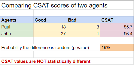
As you can see, although Paul’s CSAT on the sampled data is almost 10 percentage points lower than John’s, the probability that this difference is random (p-value) is 19%, much higher than the threshold of 5%. Therefore, in this case we cannot reject the null hypothesis and we conclude there isn’t enough evidence to claim that these CSAT values are statistically different.
In many cases, you will get this outcome because the data sample isn’t large enough to validate the analysis results. In other words, you need more data (i.e. more survey responses). Let’s play a bit with the values and add a zero at the end of each ‘good’ and ‘bad’ count.
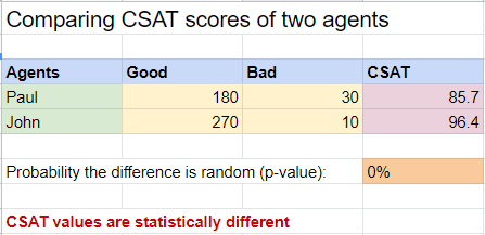
The CSAT values are the same, but the difference is now statistically significant, with a p-value close to 0%. This time we can conclude safely that indeed, John’s customers are more satisfied with the help they received than Paul’s customers.
Conclusion
The statistics method above can be applied to any metric whose formula is a percentage and is being used to compare two independent data samples. One example is CSAT (%) comparison between two agents, two teams or two channels. Another one is comparing the percentage of customers complaining about an issue between two customer segments, channels or products.
Of course, there many other CX data metrics that are using a different formula, for example averages (i.e. Customer Satisfaction as a number, Review Ratings) or a more complex percentage (Net Promoter Score, Customer Effort Score). Also, there are other types of CX data analysis that would benefit from a statistical approach like looking at trends over time or distinguishing between correlation and causation. I will cover all these strategies in future articles.
Data analysis plays a key role in any business and the organizations within, from marketing to customer support. It is now at the core of most decision making processes. However, not every data is the same. CX data is different from operational data, in the sense that it represents a sample or subset of the total population but is being used to conclude on findings about the entire population. Surveys are a great example of such data. That is why any findings from CX data should be rigorously checked using statistical methods to ensure important decisions are always made based on valid and strong evidence.