Even the most entertaining advertisements are intrusions. The viewer didn’t request them and probably doesn’t want to see them! But, as the name suggests, pop-up ads are notoriously intrusive.
When implemented badly, they’re like a screamer in a horror film. This is why exceptional pop-up design is important: it can transform the pop-up into something that is not only tolerable but also persuasive.
When creating pop-ups, collaboration is essential. It is especially important given the number of elements involved. Ensure you have effective communication in the workplace with enterprise contact center software, especially between your marketing, web design, and SEO teams.
While communication sounds easy, coming up with new marketing trends and converting your pop-ups is the tricky part. That’s why in this article, we’ve come up with 10 best practices for pop-up designs.
1. Include an attention-grabbing CTA
The CTA is the second most important element of a pop-up after the headline.
It lets a visitor know what to do next and how to complete the action. It’s not the place to beat around the bush. You need to be concise and straight to the point.
Users should only have to perform one single task and not have to think through many choices. Otherwise, you might create confusion – and a confused visitor is prone to exiting a page.
How do you improve your CTA?
You need to consider more than the button itself to achieve an effective CTA design. Background color, surrounding images, and text are all important factors to consider.
Take a closer look at the Netflix pop-up. You’ll notice that the primary and secondary CTAs are the same color as Netflix’s logo.
The bright red is strategically placed on the homepage, with the primary “Watch Free For 30 Days” CTA and the secondary “Sign In” CTA both leading to the same pricing page.

The phrase “Watch Free For 30 Days” communicates a clear benefit, reducing users’ fear before committing to sign up. “Cancel at any time” reassures users, increasing sign ups. Is it any wonder that Netflix holds so much of the market, with a CTA like this?
2. Ensure you serve your pop-up at the right time:
When creating high converting pop-ups, timing is everything. Imagine the following scenario:
A visitor is searching for the process of SaaS link building on your website and a giant pop-up ad appears, interrupting their search. They’ll be annoyed that you’re interfering with their experience, and will likely close the pop-up without reading the content.
Pop-ups have gotten a bad name because of practices like this.
Yet, if you take too long, you’ll end up missing a lot of possible conversions, as visitors might leave your website before the pop-up even shows.
How do you know when to show those pop-ups?
Here are a few things to try to get the timing right and keep your pop-ups relevant:
- Schedule a pop-up to display when a visitor scrolls past a certain point on your website page
- Display pop-ups when a user is about to leave the site, especially if they’re leaving behind a full cart
- Reveal them after a period of inactivity
It is also worth noting that pop-ups that are delayed by 3-5 seconds are not penalized by Google and can actually improve bounce rates.
If you’re wondering just what is website bounce rate? Well, it represents the percentage of visitors who come to your site and then leave rather than continuing to view other pages on the same site. The lower, the better.
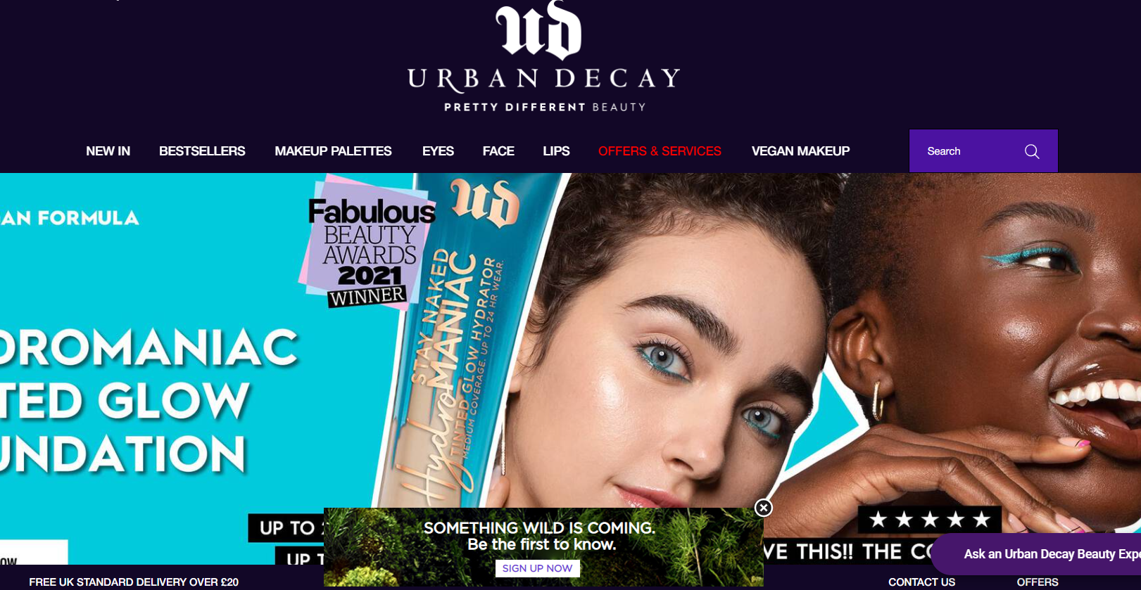
3. Use eye-catching visuals
Pop-ups face the difficult task of enticing visitors and luring them further in.
A plain, simple, and relevant pop-up is acceptable, but a pop-up with appealing images that complement the offer is far superior. Imagine you’re promoting an inventory plan. Having a plain text pop-up is going to get you nowhere – but including a beautifully staged image with a promise on how to teach others to capture the same? Now you’re talking.
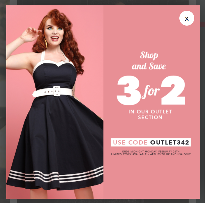
Remember: eye-catching doesn’t have to mean flashy. Take the image from Collectif below. It’s showing one of their main dress styles, and the text is clear and easy to read. The color choice fits their vintage vibe, as does the styling of the model’s hair and make-up. It’s effective, and, importantly, not overwhelming.
4. Have mobile-responsive design
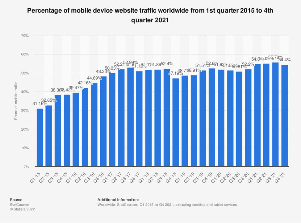
The importance of mobile visitors cannot be overemphasized. Mobile internet traffic now accounts for more than 55% of total web traffic. In this present age, if your website is not mobile optimized, you are ignoring a large part of your audience.
What applies to your website in general also applies to pop-ups. Just like in web design, it’s critical to provide different options for your visitors on desktop and mobile.
For example, images take up a lot of space on mobile, leaving little room for the rest of the message. Rather than using the same popup on desktop and mobile, customize the mobile version by avoiding large images and limiting the number of input fields.
5. Allow visitors to close pop-ups easily
Nobody wants a pop-up that they can’t close blocking their screen. Forcing a user to navigate around your pop-up in search of the close button only irritates them further.
No amount of email addresses gained is worth driving visitors away! As a result, the exit button in your pop-up campaigns should always be visible.
To make this possible, use the following pop-up best practices:
- Users naturally look for exits in the corners, so placing them there makes sense.
- Put them on a contrasting background
- Avoid making exit buttons that are too small. Misclicking can frustrate the user and cause them to leave your website.
6. Leverage conversational copy
Building trust is crucial to the success of your pop-ups. That’s why maintaining a friendly and upbeat tone throughout your pop-up copy is crucial. By default, website pop-ups should not be stuffy or salesy.
Instead of approaching potential customers as a sales target, speak to them as friends.
This is a great example of a personalized pop-up:
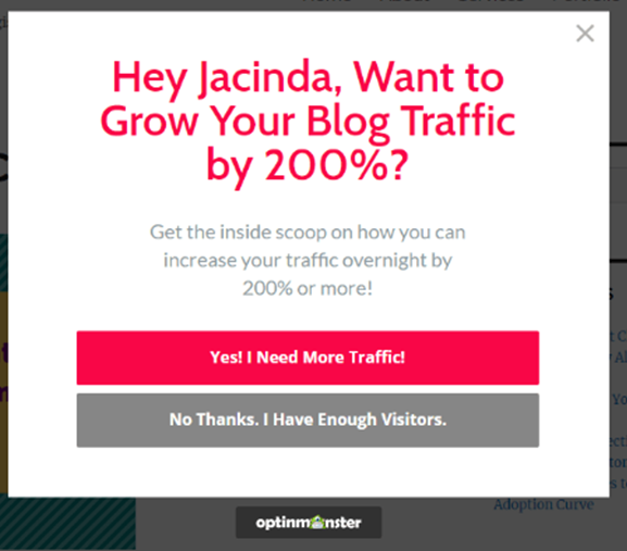
Friendly and welcoming, with no jargon or “business speak.” Take note of how the message addresses the customer by name.
Customers nowadays have high expectations of the brands with which they interact. Interactive website designs, landing pages, and pop-ups can make your brand less boring, resulting in happy users.
It’s also important to make sure customers leave the right details – a receptionist could use the phonetic alphabet to confirm spelling, but there’s no such option on web forms. Instead, consider having a confirmation field that checks whether the inputted email address matches.
7. Write short & sweet copy
Your pop-up campaigns can benefit greatly from engaging copy. Only when people recognize value will they respond, and copywriting is one way to do so.
Following these copywriting best practices for pop-ups is one way to do so:
- Concentrate on the benefits to the customers rather than the features of your product
- When appropriate, use your brand’s personality and tone of voice.
- Use simple, conversational language.
For example, imagine you own a law firm. Many of your website visitors may not be ready to hire you, but you want to catch their attention (and their information).
Rather than overwhelming them with jargon, keep it short and simple, and offer something accessible like a free virtual phone number or an open webinar.
You can then maintain relationships with clients through multiple channels, such as using local phone numbers for your business.
8. Add a countdown to encourage action
A countdown serves a simple purpose: it creates a sense of urgency. These types of pop-ups can be used for ticket sales, product launches, and on-demand webinar sessions with limited time offer. According to some studies, this pop-up best practice can help increase conversions by up to 147%.
The trick is simple: you must show that your product has a limited time offer. This may appear to be an unusual strategy to some, but creating a sense of urgency and a need to cash in on a deal that appears to be popular before it disappears are powerful motivators for the consumer.
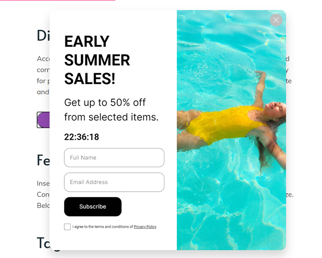
Here’s a great example of a countdown pop-up campaign:
9. Minimize the number of fields on your forms
Pop-ups are a multipurpose tool. They can be used to collect contact information or to persuade users not to abandon their cart.
However, you don’t want to try and do it all at once! Users shouldn’t have to spend more than a few seconds filling out forms, and they certainly don’t want to. For example, if you’re trying to get people to register for an adhoc testing webinar, your request should be short and simple, with no need for the user to think about it.
Let’s see an example:
This pop-up is designed to be as unobtrusive and brief as possible. It only features a single button that takes users to a sign-up option.
If you need anything else, ensure that they can quickly click a button or select from a drop-down box.
10. Make some enticing offers to new visitors
There are numerous design elements to consider when creating a pop-up for your website. However, creating a great-looking and effective pop-up isn’t as difficult as it may appear when you follow these guidelines and best practices.
Your pop-ups will not only look great, but they will also produce fantastic results.
Just make sure to resist the temptation to follow the crowd and avoid bombarding your users with interruptions to boost short-term metrics.