
We all think we can just intuitively create great customer experiences when designing website and app journeys. But even the biggest Pros say that 80% of what they launch does not work out the way they thought. Customers behave differently from what they imagined.
By that they don’t just mean that 80% of new journeys have bugs and unexpected points of friction for users. But they mean that customers see the journeys differently than what they imagined.
Skillful use of customer experiences data is the solution
As a result, the key skill for improving customer experiences is to use data to understand what’s working, what’s not. By understanding how our customers are actually seeing and navigating the website. and app experiences that we create, we know what to improve. By understanding what customers are trying to accomplish when they are in our journeys, we can inform the A/B tests and redesigns that are most likely to serve their needs.
So then, where is the rub?
Where are our biggest blindspots for using data to improve digital customer experiences?
Hence, my idea to create a free self-assessment tool for skills gaps and blindspots for improving digital customer experiences.
By answering 10 key questions, you can narrow down in a few minutes what’s holding your company back from creating seamless and engaging digital experiences more often. For example, questions about
- The data you have available
- Which of your teams are using this data vs. not
- Which of the key use cases are they using it for vs. not yet
- To what degree are metrics aligned to the company’s North Star
- etc.
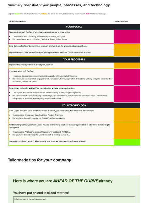
The self-assessment output
The output of the self-assessment tool is a radar chart that compares your results to the typical benchmark “where the bar is at” in the industry.

You also get a detailed set of recommendations for your company’s biggest skills gaps to close.
Lessons learned for myself
Now, is this very ironic, or very much on the point? When first designing the questionnaire with 10 multiple-choice questions, I did eat my own dog food as they say. Namely, I made sure I used some of those key data to assess the experience before launching the tool.
Specifically, in this case I made use of Usability Research & Testing which is one of those key data sources that help close the blindspots. Namely, you have test users complete a task on the new journey and record their behavior and their thoughts.
And, was I magically able to design an intuitive questionnaire experience?
Test users were unanimous in their feedback.
The questionnaire sucks, it’s so confusing!
In how many ways did the experience suck? Let me count the ways.
- The order in which each question displayed a drop down box for answer choices vs. helpful explanations that came afterwards confused users.
- When you opened a drop down with the answer choices it covered up the text with explanations
- Were users supposed to click on the explanations or select from the dropdowns?
What a mess! While the journey seemed so obvious to me, it was a complete UX blocker for users.
That’s exactly the point!
It’s exactly why the self-assessment tool exists. Not using UX testing would have been one of those skills gaps and blindspots that the tool watches out for.
What’s holding your company back then?
You don’t know what you don’t know. Give the self-assessment tool a try maybe and find out for yourself.


