
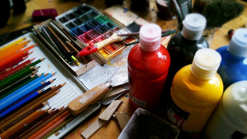
A picture paints a thousand words.
Vision trumps all other senses.
Most website visitors only read about 20% of your web page.
A moving picture is worth a million people.
You probably already know where this is going. Yes, I’m trying to make a case for visual marketing.
But what is visual marketing, exactly?
Visual marketing is a vital component of digital marketing. It uses cognitive psychology and visual perception to harness the power of images and visuals to:
- Connect with people
- Engage with them
- Define their choices, ultimately
What the stats say about visual marketing
According to statistics compiled by HubSpot:
- Visual marketing was the most important form of marketing for 37% of marketers, second to blogging, which was 38%.
- According to Cisco, 80% of all traffic by 2019 will be from videos.
- Consumers are 4X more likely to watch a video about a product than read about it.
- Infographics are 3X more likely to get shared or “liked” on social media compared to other types of content.
Bannersnack also has its list of stats:
- On social media, visual content is 40X more likely to get shared than other content types.
- Visual assets are used by 71% of online marketers on social media.
- About 65% of marketing professionals who hold senior executive positions believe that videos, photos, infographics, and illustrations are central to communicating their brand’s story.
As for what’s to come in 2018 for visual marketing:
- Videos will be more important than ever for online engagement. [Smart Insights]
- Interactive visual content will be huge in 2018. [Neil Patel]
- Virtual and augmented reality will become mainstream in 2018. For those not ready to take the plunge, your next best bet is improved visual content, which also lays the prep work for future AR/VR experiments. [Forbes]
- Artificial intelligence and image recognition will transform social media marketing. [Adweek]
Visual marketing tips for non-designers
But here’s a question: What if you’re not innately artistic?
And here’s the answer: You don’t have to be a designing powerhouse to get started with visual marketing.
This article offers a few tips and tools that have so far stood the test of time to help you create professional-looking visuals without having to go to design school.
Tip #1: Simplicity is key
Quora is one of those places where you get brilliant answers to various questions. About what exactly is simplicity in design, this answer stood out:
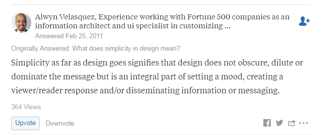
Let’s say that again for emphasis:
Simplicity in design does not obscure, dilute, or dominate the message but sets the mood.
And then, there’s this:
“[S]implicity is sanity.”
That’s from the first sentence of a blurb on Amazon for The Laws of Simplicity, a book by John Maeda, a designer and technologist who was also the 16th president of the Rhode Island School of Design.
Bottom line: Don’t cram too many elements into your design. Allow your content breathing room by keeping it focused and to the point.
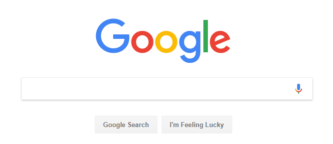
A prime example of simplicity in design is the Google homepage:
Tip #2: Take advantage of whitespace
Whitespace (also referred to as negative space) is the empty space between the elements of a page or design. Whitespace is not a waste of space, and as some designers put it, it is possibly the most important design element.
There are several reasons why you should use whitespace:
- To emphasize
- To eliminate distractions and improve focus
- To enhance the readability of a page or design
- To better organize the elements of a page and clarify their relationships
- To create visual hierarchy
- To allow the reader time to absorb the underlying message
- To enhance the user’s experience
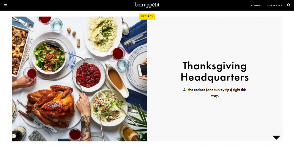
Some examples of web pages taking advantage of whitespace:
Bon Appétit
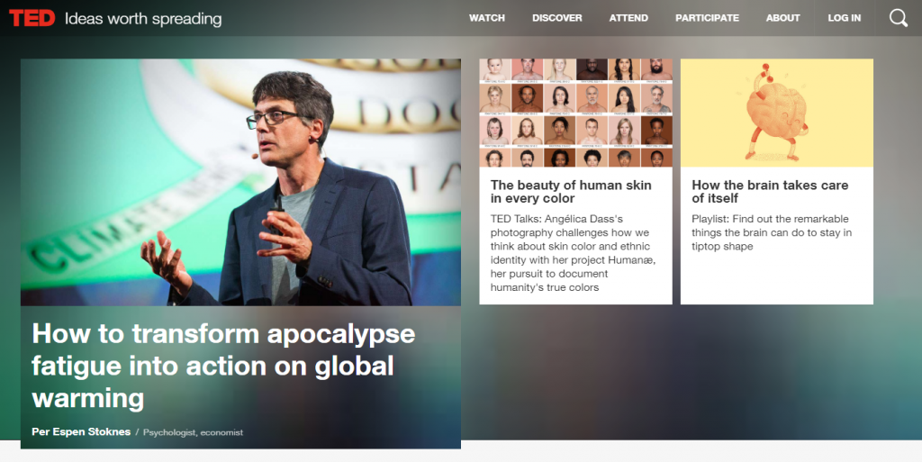
TED.com
One important myth about whitespace that needs debunking: It doesn’t have to be white. It can be any solid color, even a blurred background, and may incorporate a bit of movement, says Design Shack.
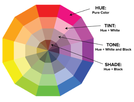
Tip #3: Choose your color combinations wisely
Gregory Ciotti wrote an interesting article on the psychology of color and persuasion. He says:
According to research, personal experiences, upbringing, preferences, culture, and context often muddy the impact individual colors have on people. Therefore, the notion that the colors yellow or purple invoke any type of hyper-specific emotion is inaccurate.
Operative word: context.
About color combinations, Prototypr has a few tips:
- Use the 60-30-10 rule. This formula infuses color balance into your design and uses the following color distribution: 60% for the dominant color, 30% for the secondary color, and 10% for the accent color.
- Take advantage of color associations, such as black and white for elegance, white for purity or cleanliness, black for mystery, or red for passion. (Again, context. You need a keen understanding of the mood, message, and audience you’re targeting for color associations to work in your favor.)
- The best color combinations are inspired by nature. You only need to look around to see which colors work in harmony with each together.
HubSpot has a 101 on how to choose the right colors for your designs.
Tip #4: Typography: It goes beyond font types and sizes
Just what exactly is typography?
Here’s a good definition from Practical Typography:
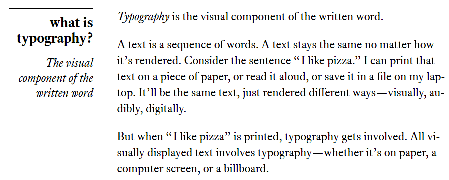
Typography involves several different factors, including:
- Typeface (font style)
- Size
- Color
- Kerning (space between letters)
Shutterstock offers some typography tips:
- Start with the right font. Avoid free fonts if you want to up your game.
- Understand font pairing. Consider how typefaces work together. Fonts in the same family share fundamental characteristics and therefore make a great team.
- Pay attention to your paragraphs. Consider paragraph alignment. Justified or aligned left?
- Make color contrast adjustments, if necessary. Adjust the color for maximum contrast and readability.
- Get creative but don’t exaggerate. Novelty fonts can cheapen your composition’s look. Classic typefaces like Garamond, Helvetica, and Baskerville still exist for a reason.
Bottom line: The basic idea behind typography is for your content to be easily readable.
Tip #5: Optimize your images for faster loading time
You may have the best design on the planet, but if the page it’s on takes too long to load, expect to lose visitors.
There are multiple ways to optimize images to reduce load times:
- Use photo compression applications that let you condense your files without negatively impacting image quality. Examples: Adobe Photoshop’s “save for web” feature, TinyPNG
- Be mindful of file formats. For example, JPEGs keep the file size small but may lose some degree of quality in the process. On the other hand, PNGs and TIFFs tend to generate large file sizes.
Tools and web apps for non-designers
Tool #1: Shutterstock
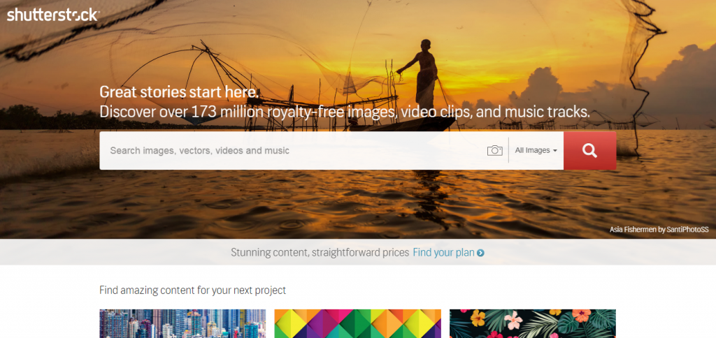
Shutterstock is an online platform that hosts millions of stock photos, illustrations, vector graphics, video clips, and music tracks in its library. It also has an editor that allows users to customize the images they choose and quickly create ads, slides, or social media posts.
Tool #2: Bannersnack
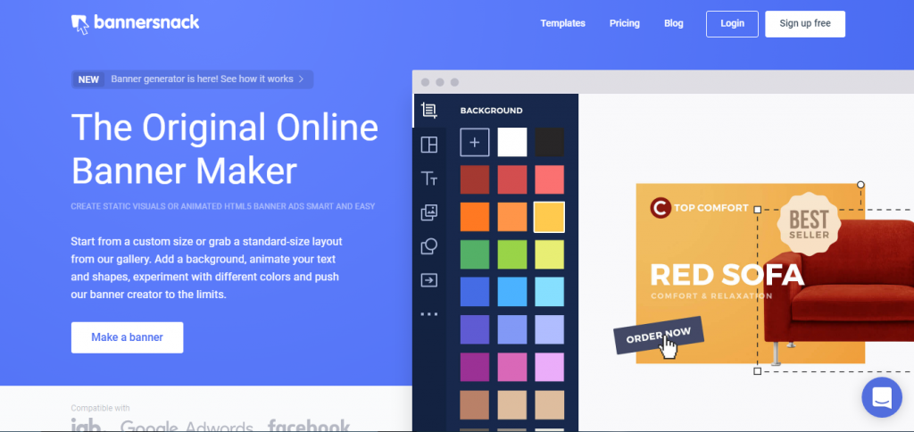
For your different banner needs, Bannersnack offers templates for various industries, including business and technology, automotive, health, events, travel, fashion, and services. Different banner types are available and can be used on various platforms: mobile, Facebook, Twitter, Instagram, YouTube. etc.
Tool #3: Snappa
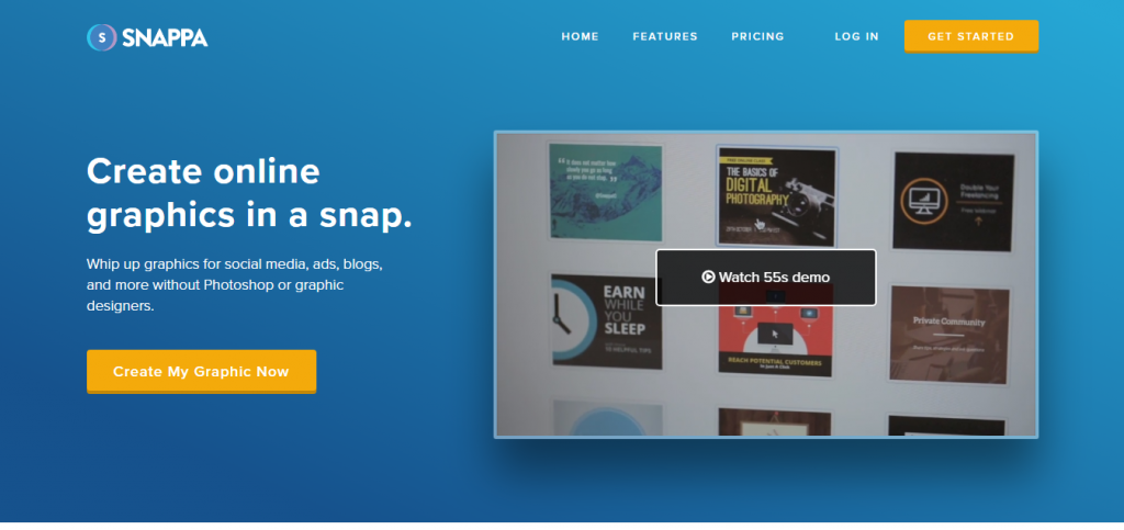
Snappa is an online graphics tool that lets you create visuals in a snap. Start designing using professional-looking premade templates and high-resolution stock images from their extensive image library. The app also lets you save and pre-schedule your designs for social media posting through its integration with Buffer.
Tool #4: PowToon
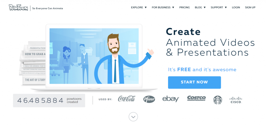
If you want a fun alternative to boring slide presentations, PowToon is a web-based animation tool that lets anyone create video animations within minutes. It comes with numerous templates and images to get you started.
Tool #5: Visme
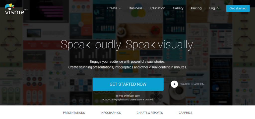
Visme allows you to create visual content such as infographics, presentations, graphs and charts, and many more. Over 500 templates and 6,000 icons are accessible for users in its image library.
Final word
Not every marketer is born with the knack for design, but that should not stop you from taking advantage of visual content for marketing. With the direction marketing is taking, you’re doomed to extinction if you insist on putting visual marketing on the back burner in favor of more text-based forms of marketing or advertising.
This is not to say that text is no longer important. Text-based communication is still core to marketing, but to be truly effective, you must incorporate visuals and images into your content. If you’re a non-designer, the above tools and tips should get you started in the right direction.
What other designing tips and tools can you share?
______
A note on images: The top image is from Pixabay. All others are screenshots from sources indicated in the piece.


Wonderfully Explained…
In Short, Font + Image + Free Tools Online = Visual Graphics for Non Designers.
I would like to suggest, “Canva”, a another free tool for Nice free graphics creation.
Thanks,
Ketan J
I am in my 60’s and in talking with people my age we have some problems. The fonts are getting smaller and the gray color used in so many documents makes it harder for people aging to read. So please help us out. We want to read information but make it easy for us not harder.