
Picking up the other day on some tweetchat about the new look Twitter, I soon found myself watching the video “Twitter: discover what’s new in your world”.
From what I could see, the changes looked interesting enough, although I did have a moment of wondering whether the changes were going to improve our user experience, or just complicate it.
Then a bit later I noticed the message at the top of my Twitter home page, inviting me to preview the new look. So I decided to investigate.
Oh No! What Have They Done to My Background?
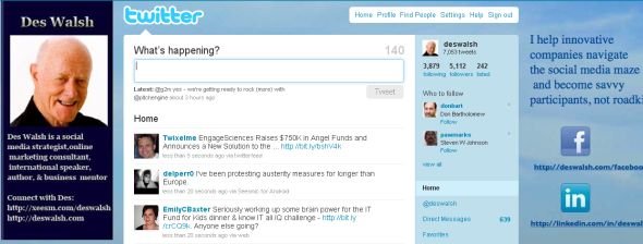
This was the “look” of my Twitter page at that point, i.e. before I flipped to the new look.
This is what it looked like when I clicked the new look preview option (note that at this stage the process is reversible).
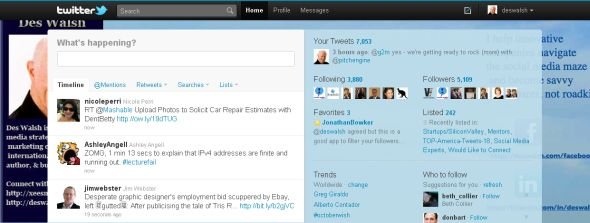
My first reaction was fairly atavistic, as in “Oh no! My specially designed, branding-type Twitter background is now worse than useless!”, in that the images and text were so severely chopped.
And I thought about all the people who not so long ago had paid out good money to have backgrounds designed and wondered how they would be feeling at this turn of events.
The I thought I should get to work and find out how best to deal with the new arrangements, from a branding point of view.
How to Design a New Background
Jonathan at Banyan Branch offers data on the space now available for background design and some detailed advice on how to create a new background to go with the new look Twitter interface. I noted particularly his advice, with rationale, to use a .PNG image file rather than the .JPG format. He comments too that while our Twitter backgrounds won’t be as important as they were, a good background will still help to set a brand apart on Twitter.
Consider the New/Improved Features
Carla Young at Momeo Magazine outlines the new embedded media and related content features and the changed setup for the user profile, adding some helpful advice on that item, as follows:
Update your bio to tell potential new followers why they should click the follow button. Include personal details, not just the boring condensed version of your elevator speech.
Conclusion
I’m not convinced that I’ll be using the Twitter interface now in lieu of the Hootsuite app which is my main tool for managing my Twitter activity, but my sense is that although the borking of the backgrounds is at least a nuisance, the changes offer a prospect of a better user experience overall and the new features should be able to be used effectively enough for branding.


