
Data analysis is at the heart of a productive team.
Using the best salesforce apps allows your team to ensure the continuous growth and sustainability of your enterprise.
You want inaccurate sales data to become a thing of the past. So, we’ve put together the 10 must-have Salesforce dashboards to help your teams make the most of the available data to generate real-time, accurate, and helpful information to maximize their productivity.

Why Use Salesforce Dashboards in 2022?
Salesforce dashboards are simple to set up, easy to use, efficient, and adaptable, so why would you ignore the benefits they could bring to your enterprise?
Who Benefits from Using Salesforce Dashboards?
Salesforce dashboards can help with the daily activities of all company employees, from lower levels to senior management, and especially your data analytics consultant. The company and its customers benefit when teams use the wide range of Salesforce dashboards that apply to their needs and intended outcomes.
Salesforce dashboards offer an all-in-one solution for companies to generate, track, and analyze data to ensure sustainability. Like RFM analysis, Salesforce dashboards provide detailed reports that can be used to inform decision-making and customer relationship management.

Plus, customers benefit, too. The key service KPIs in Salesforce can be used to analyze the customer experience at every stage—ensuring the best outcomes and maintaining customers rather than potentially losing them following a negative experience.
Advantages of Using Salesforce Dashboards
If you want to encourage your teams to adopt Salesforce dashboards, the advantages speak for themselves.
The simple graphics and visuals are easy to understand, even through deep learning convolutional neural networks.
Reports can be easily customized to provide real-time, accurate, and relevant data. Plus, all this is easy to access from a central hub using cloud-based software with an official software contract.
Companies have had to adapt their working processes with more teams working remotely. For example, many have dropped their physical communication devices and opted for alternatives.
Salesforce dashboards can be used anywhere, allowing teams to access the data they need when they need it.
However, for them to be really effective, you need to include the relevant metrics featuring data that teams need, or they will not see any benefits to adopting the tools.
List of 10 Must-Have Salesforce Dashboards You Should Consider Implementing
1. Sales Executive Dashboard
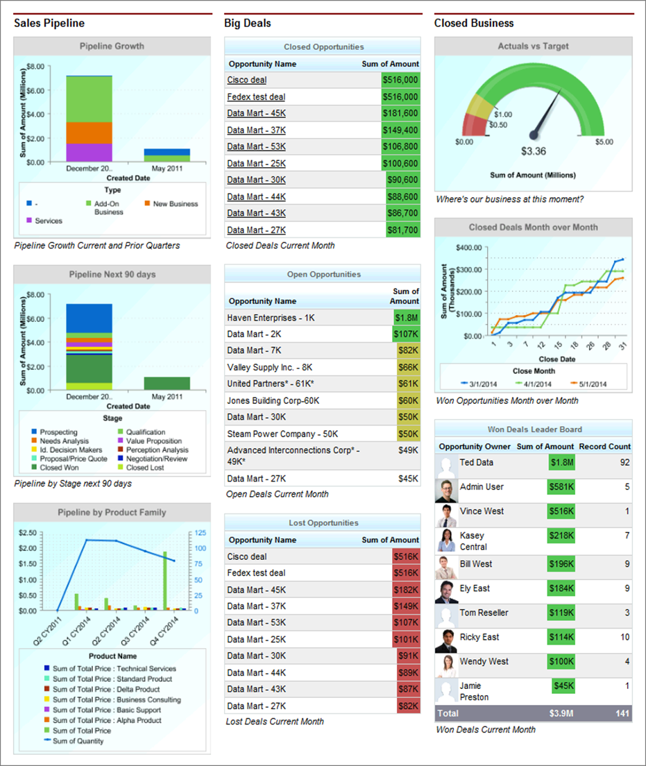
The Sales Executive Dashboard Source provides senior managers with a snapshot of all sales activities. It is an essential daily tool that allows managers to see the activities of their sales reps and revenue generation across their territories.
Sales executives can customize the reports to see figures year on year, quarterly, weekly, or daily, and create comparisons. Having this data in one location allows leaders instant access to relevant, accurate, and up-to-date data.
This information can then be used in several ways including providing feedback to their superiors to inform decision-making, and helping executives pinpoint low-performing employees that may require additional training or motivation to help them improve.
Key reports and charts to include on this dashboard are sales pipeline comparisons, pipeline forecasts, current deals, closed business, actuals versus targets, and a won deals leaderboard for team members.
2. Pipe Gen Dashboard

The Pipe Gen Dashboard is another daily tool that allows you to ensure you have enough in your pipeline to meet your target quotas. Don’t wait until the end of the month or quarter to check the status of your pipeline. If you don’t have enough to help you reach your quota, you need time to fix it.
The Pipe Gen Dashboard provides insights into the sales pipeline. Plus, it allows users to identify potential issues before they become serious problems. It can help pinpoint underperforming pipelines that you can then investigate and improve.
Overall, this dashboard allows companies to be proactive regarding issues with the sales pipeline rather than reactive.
The key metrics to include on this dashboard are weekly pipe gen, open pipeline by the deal band, open pipeline by close date and stage, and open pipeline for the fiscal year.
3. Forecast Dashboard

If you want a clear picture of the sales forecast for the next quarter, use the Forecast Dashboard. In one place, you can access a clear and complete picture of your opportunities, your pipeline, which deals have the potential for growth, and a comparison of actuals to quotas.
You can track areas that may potentially cause concern and be proactive to help resolve these issues. For example, you may need to provide additional training or coaching to team members to help them meet their quotas, plus, the forecast provides accountability.
The key focus on this dashboard should be sales quotas and quota attainment rates. Use current deals by pipeline and current pipeline values to help create accurate forecast charts to help you monitor performance.
4. Sales Rep’s Dashboard

The Sales Rep Dashboard allows individuals to monitor their performance and creates accountability. Sales reps can access data regarding how their leads are progressing, deals they have closed, and their forecast, to see if they will hit their target and adapt their strategy accordingly.
This is another essential daily tool that provides a focus for sales reps, empowering them to make informed decisions without enduring the grind of collating the data.
As evidence of performance and success, the Sales Rep dashboard is a great way to encourage adoption. If team members fail to use the tool, then their performance figures at their next team meeting will prove disappointing.
To help track performance and provide accountability, a Sales Rep Dashboard should include metrics and charts on the individual reps’ closed business, their pipeline, their activities, their forecast, their top opportunities, and a team leaderboard.
5. My Team Dashboard

The My Team Dashboard can help incentivize the entire team to meet their targets and provides a little cross-team competition. It is also another great way to encourage adoption, getting the whole team involved and actively using metrics to help improve performance.
Many teams display the dashboard on a TV screen so everyone can see the data and encourage that competitive spirit.
This dashboard could feature metrics for top deals per team, a team leaderboard, a team with the highest pipeline for the month, and teams with the highest amount of revenue for the quarter. Or, if the team is service-based, it could include metrics for open cases or resolution times.
6. Leaderboard Dashboard

If you really want to promote a little competitive spirit amongst the team and provide accountability, focus on leaderboard metrics to provide recognition and motivation. The Leaderboard Dashboard also allows opportunities for mentoring programs.
This dashboard can display revenue generation comparisons for each sales rep but also insights into lead conversions. The primary function is to track performance and help managers monitor the productivity of individuals on their team.
Again, you can encourage adoption by running monthly competitions. If the data is not in Salesforce it doesn’t count. Therefore, if your reps want to win, they have to use Salesforce.
For example, your company may promote the best headset for virtual meetings, and to push sales, you could offer a cash prize to the sales rep who sells the most by the end of the month, and the dashboard will provide a continuous update for the team to encourage competition.
The key reports here are closed-won opportunities by revenue, won opportunities, current period revenue by team member, quota attainment by team member, and completed activities.
7. Customer Service Supervisor Dashboard

This dashboard is specifically for leaders of customer support teams, providing a breakdown of day-to-day operations.
Managers have direct access to data regarding the performance of their team. They may wish to identify the team member who resolves the most issues or the average age of open cases. It could be a valuable tool as part of relationship marketing for hoteliers who may want to keep a close eye on unresolved complaints from their guests.
A Customer Service Supervisor Dashboard should feature the top performing agents still operating under your agency agreement, the average age of open cases, and open cases by priority.
8. Service KPIs Dashboard

While the previous dashboard provides insight into a particular team’s performance, this customer service dashboard looks at the KPIs for the entire organization’s service.
Targeted at senior service executives, this dashboard provides insight into important trends that can influence decision-making for staffing and training.
You can check central metrics like the trend of closed cases or case distribution by type and priority.
A Service KPI Dashboard should include metrics and graphics for cases closed for the month to date and case resolution times, plus case distribution by support channels, type, and priority.
9. State of the Union Dashboard
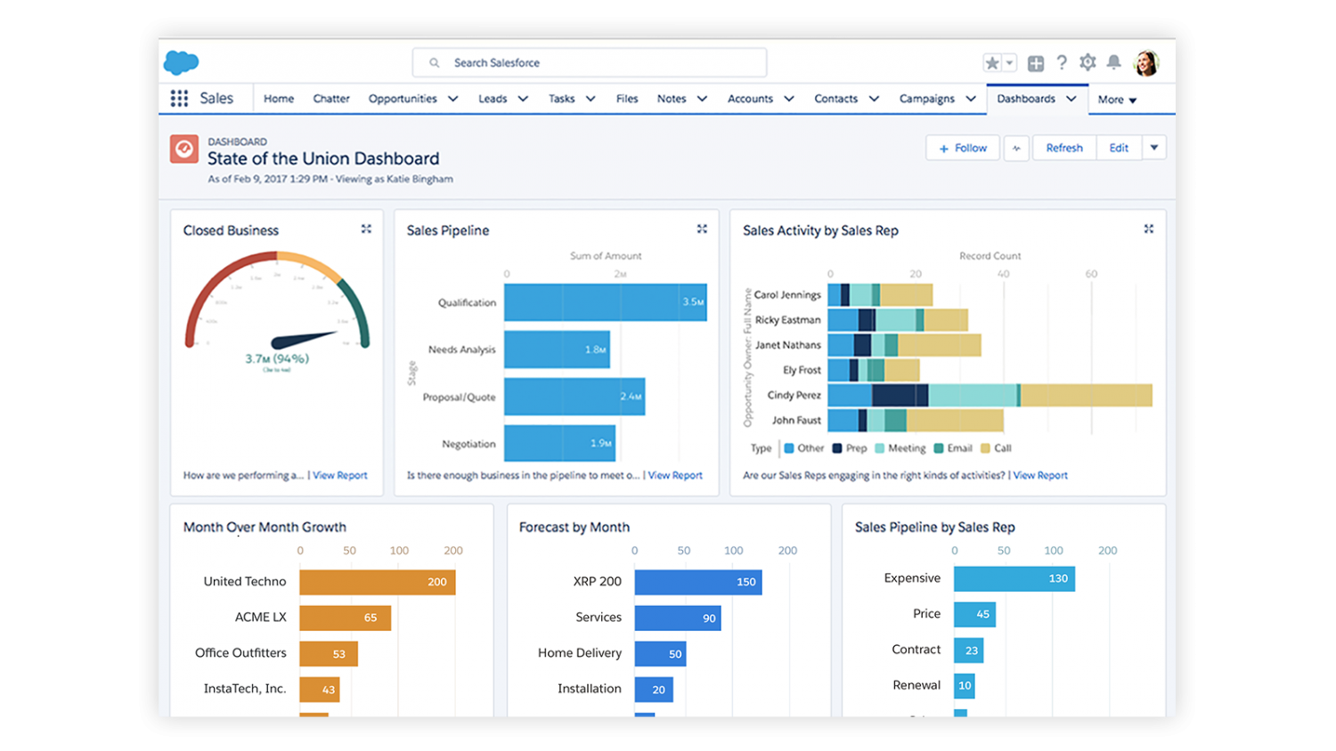
If you want to check the overall performance of your organization, use the State of the Union Dashboard. In one place, you can view KPIs for total closes, open pipelines, and team performance.
Providing comprehensive data regarding your company performance, you can customize this dashboard to make it relevant to your needs.
You could feature metrics for the sales pipeline, closed business, month-over-month growth, monthly forecasts, and sales activity by the sales rep.
The real bonus of this dashboard, that you can use to promote adoption, is the time-saving factor. Senior executives no longer need to wait for their teams to gather the data together. It’s all there in an easy-to-access format, constantly updating and changing so executives are always in the loop.
10. Open Pipe Dashboard

While the Pipe Gen Dashboard allows you to check if you’ll meet quotas, the Open Pipe Dashboard allows you a deeper insight into the functionality of your pipeline.
It’s important to monitor your pipeline at various stages to see if it’s working sufficiently. Like continuous integration, you may need to make minor changes now and then to improve performance.
The Open Pipe Dashboard allows you to inspect areas that are clogged up or underperforming. Are large numbers of deals being lost at the same point? Are some deals going cold and clogging up the pipeline?
This dashboard will help you identify any faults and enable you to resolve these issues and ensure your pipeline continues to expand.
The key KPIs and reports for this dashboard include open pipeline by stage, open pipe by forecast, open pipe by source, and open pipe for the next month.
Conclusion
Choosing and correctly implementing the best dashboards that fit your company and team’s vision will be one of the best strategies to improve the overall company’s performance and revenue. Implement alongside other forward-thinking strategies like BYOD policies, you can really future-proof your firm.
Salesforce Dashboards provide the data companies need and can be customized to ensure teams have access to relevant data that increases their productivity and thereby encourages adoption.
Using the dashboards that apply to your business agreement contract and implementing Salesforce integration with other systems, you can generate detailed insights into your enterprise’s functionality and outcomes and make informed decisions to ensure sustainability.


