As any regular reader of this space will know, I am a fierce evangelist for the “sell the offer, not the product” approach to B2B email creative. That approach rests on the assumption that by selling the value of whatever it is you’re offering the reader (a white paper, a Webinar, an ebook), and not your product or service, you’re more likely to generate response from interested prospects.
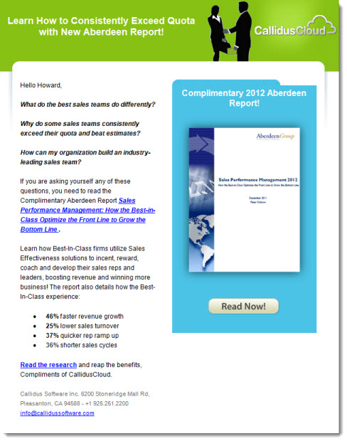
On that score, there’s a lot to like about the email campaign below from CallidusCloud, a leading provider of cloud-based business software solutions. Most notably, it’s to the writer’s credit that not once in the email is there any mention of the CallidusCloud solution, or even what the company does. Every ounce of copy is dedicated to selling the value of the content on offer, in this case: an analyst report from the Aberdeen Group.
So kudos to the marketers at CallidusCloud for not succumbing to the temptation of explaining how their technology can help companies attain the very same industry standards that the report describes. Instead, the email is selling information of value, and moreover, that information is positioned in a way that would appeal to prospects suffering the very business problems that (presumably) can be addressed by CallidusCloud software.
Here’s what else I like:
1. A headline in HTML text (versus an image). This ensures the headline will be visible in most email clients even with images turned off.
2. The header takes up little vertical space, and so avoids pushing valuable selling copy below the fold.
3. The offer is mentioned early and often, and there are a total of three calls to action: a button in the right sidebar, and two text links in the body copy.
And here’s what I’d change:
4. Wow, that white paper image is ENORMOUS. I’m a huge proponent for featuring offer images in email campaigns (it makes the offer seem more real and tangible), but in this case, the image itself is so large that it’s forcing much of the main selling copy to appear below the fold. A much smaller image in a narrow right sidebar would serve the same purpose and the email would look a lot shorter as a result. Furthermore, the entire offer image is invisible when images are turned off in Outlook.
5. The questions that open the email read awkwardly to me. I can understand how they’re intended to promote the learning value of the content on offer, but in the context of a letter-style email, they seem out of place. (First you say hello, next you’re asking me a bunch of questions?)
I would do one of two things: either a) turn the questions into benefit statements, as in: “In a compelling report from the experts at the Aberdeen Group, learn the secrets behind how some sales teams consistently exceed their quota” and so on, or b) move the questions into the headline, where they’d serve to grab the reader at first glance.
6. Drop the exclamation points. Admittedly, it’s a particular pet peeve of mine, but as an early mentor once told me: in business writing, exclamation points are a crutch for a weak argument. Put another way: if your message is strong enough, you don’t need them.
What do you think? Agree/Disagree? Anything else you’d change?
For more tips on email creative, download a free copy of our white paper: “Top 10 B2B Email Marketing Mistakes.”


Could not agree more that less selling is more in emails. And I found your analysis spot on, Howard.
Emphasizing the offer is good. And your point about the headline in HTML text is good. It should work on all devices.
But what I really liked was your comment on the questions. They come right after hello. As you say, it would be far better to open the email with a simple and clear statement, like you used.
I wish I could share some more tips, Howard, but you nailed it. Great work!
Jeff Ogden, the Fearless Competitor
President, Find New Customers
Host of Mad Marketing TV
Producer and Host, Marketing Made Simple TV