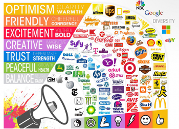
Marketers have a whole bag of tricks that they use to convert customers and generate leads. One of the least talked about, but most important, tricks is the use of color to convince consumers to feel and act a certain way.
The connection between human perception and color is hard to deny. There have been multiple studies showing how a majority of people react or feel a certain way when exposed to various colors.
We want to take a dive into color psychology and look for ways you can use this technique to boost sales on your eCommerce website. Our tips cover the things you need to look for, how to generate additional engagement by using the right colors, and how to continuously grow your business based on your design and color scheme with split testing.
Pick a Color Scheme that Matches Your Brand Identity
The first topic we are going to look at is the connection between colors and brand identity. Earlier, we mentioned that colors could make people feel certain emotions and act accordingly. Let’s take a look at some common colors, and what emotions they inspire, so you can create a brand logo that matches your message.
Have you ever noticed that many fast food restaurants use red in their logo? McDonald’s, KFC, Pizza Hut, and the list goes on. The reason behind this decision is simple — red is known for creating a sense of urgency and excitement and can boost feelings of hunger. Restaurants have found success using red in their logos because they encourage customers to come in and eat, but leave quickly.
The color blue is often used by businesses who want to build trust with their audience. Companies like Dell, HP, Facebook, and JP Morgan use blue when they want to present themselves as dependable and trustworthy.
Finally, let’s take a look at the color green. In most cases, green is used to promote feelings of peace and being one with nature. Consider the brands that use green in their logos, such as Animal Planet, Whole Foods, and John Deere, and you can see a connection between the companies and all natural/nature products.
Here is a complete chart for you to reference:

SOURCE
Use Contrasting CTA Buttons
The goal of a call to action (CTA) button is to convince the customer to sign up for your email list, or to buy a product. A good CTA will help you generate more leads and result in more sales.
If you want to create an effective CTA button, there are a few things you have to consider when it comes to the design. First, is there a distinct contrast between your CTA and the rest of your page? The best way to get customers to see your call to action is by creating a button that is drastically different from the rest of your page. Your request is more likely to pop out, which will catch the attention of your readers.
Next, you’ll want to make sure that any images or video you feature on the CTA page matches your brand message and color scheme. For example, if you’re trying to get users to sign up for your email list for happiness and productivity hacks, you’re going to want to use a featured image with light colors, smiling faces, and positivity. Similarly, you may want to go with an orange and white color scheme since orange is a color that makes consumers feel friendly and cheerful. Finally, finish the page with a blue CTA since blue will contrast well against the rest of the page, and it inspires trust.
Split Test Color Schemes
Finally, you’re going to want to split test different color schemes to see what works for you. It’s usually a good idea to change one thing at a time so you can monitor the results with constants, thus reducing the chance that you’ll obtain false information.
You can split test your marketing pages in hundreds of different way. If you want to experiment with color, it may be a good idea to change the color of your CTA once in a while and determine whether or not different colors yield different results.
If you’re paying careful attention to your website analytics, you’ll be able to tell if the change in color made a drastic difference in the number of people who converted. You’re going to want to compare the number of sessions to the number of people who converted and then figure out if your new CTA is helping to generate additional sales.
Conclusion
Color psychology has had an impact on the way businesses connect with their audience. As more research becomes available, we are all learning more about how to use color to build a better customer experience, which translates to additional sales. As a final tip, once you are done split testing the color of your website, you may want to start running tests on your content and images to see if there’s room for growth in other areas of your website.


