For the past five years, the largest U.S. banks have seen a gradual decline in growth of active mobile banking customers. Banks are slipping when it comes to delivering a customer experience (CX) that meets or exceeds consumers’ digital expectations.
The incentive for retail banks to better engage their customers on mobile apps extends well beyond customer retention and delight; it also directly impacts their bottom line. Bain & Company found that every time a customer calls or visits a retail bank, it costs the bank $4. However, if that same transaction can be completed via a mobile app, it costs only 10 cents – 2.5% of the cost for transaction at a branch.
Given the loyalty and financial impacts of delivering an engaging and frictionless digital experience, big banks must be setting the industry’s bar for mobile CX, right? Not so fast.
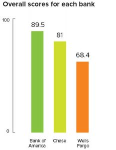
UserTesting conducted a competitive benchmarking study comparing the mobile app CX of the three largest banks in the United States – Bank of America, JPMorgan Chase, and Wells Fargo – in order to understand what frustrates or delights mobile banking customers. 300 mobile banking customers evaluated their banks’ mobile apps based on five key CX factors that improve ROI and increase loyalty: Ease of Use, Speed, Credibility, Aesthetics, and Delight.

Bank of America earned the highest ratings overall, given the speed at which customers could perform typical banking tasks. Some noted that using the app was much faster and easier than visiting a brick-and-mortar branch. Wells Fargo rated lowest overall, primarily because customers had difficulty navigating to their monthly online statements.
Across the board, participants indicated that tasks they would normally perform day-to-day were easy. But when it came to something more uncommon, such as setting up a fraud alert for changes to their username or password, nearly all found the task frustrating or impossible to complete.
Creating Fraud Alerts — Miles to Go for Chase
Customers disliked the lack of clarity around where to find alerts, and for many, the alerts feature did not work. This is surprising given consumers today are well-informed about malicious programs aimed at smartphones and tablets. A recent FICO study found that 44% of U.S. consumers rate identity theft and banking fraud as their biggest concern in life.
Chase had an unconventional process in which consumers had to tap the top of the screen to switch to the alerts category. It was unclear where to tap in order to locate the Online Security alerts settings, and the task was time-consuming, resulting in a third of participants never locating the setting. BoA’s notification and alerts feature didn’t work for many customers, and some received an error message that did not explain how to fix the problem. Wells Fargo had a more intuitive flow for setting up a fraud alert, which was easily located from the app’s main menu.
Viewing Statements — Wells Fargo Stumps Customers
UserTesting asked customers to find their account balance and the statement for April 2017 in their checking accounts. Bank of America customers found navigation within the mobile app was smooth and fast, enabling them to complete most tasks – including viewing statements – within a minute. Likewise, most Chase customers were able to complete the task of searching for and viewing a bank statement on their mobile app.
The study revealed an important lesson, however. If not for a single, simple task – viewing a past statement – the bank that scored the lowest, Wells Fargo, may have rated much better. Statements simply were not available, leading to frustration that negatively impacted customers’ perception of the entire experience.
Transferring Money — Straight A’s: Bank of America Lags (just a touch)
Participants were asked to transfer funds from their savings to checking account. This task was best-rated for participants across all apps. The function was easy to find and use, particularly for Chase and Wells Fargo customers. Chase customers said the option was right on the main screen and visible without scrolling. Wells Fargo participants found the Transfer Money link within the main navigation menu, as well as an icon on checking and savings account screens.
Customers’ experiences with Bank of America’s mobile app lagged Chase and Wells Fargo just a bit. BoA customers appreciated a Review screen before submitting the transfer, as well as having the decimal point already in place when they entered the amount being transferred. However, several disliked that the Zelle feature (to send others money) was placed above money transferring between account, which could lead to accidentally tapping on it when they intended to transfer between their own accounts.
“To understand and ultimately improve the quality of their customer experience, retail banks need to understand why the industry ranks the way it does,” explains Forrester. With the abundance of CRM, web analytics and other metrics-driven tools, marketing, design and product teams can get lost in data, overlooking the importance of complementing quantitative data with humans insights as well.
Retail banks are in a unique position to dramatically improve their mobile app CX by zeroing in on the insights their customers provide. As the study revealed, even a minor change to an app’s navigation or functionality can alter a customer’s entire perception of the brand, benefiting the bottom line.


Great article and I couldn’t agree more, CX cannot be ignored when developing a mobile app since it incorporates the largest possible audience on a single platform.