
The purpose of a website is to convert visitors into buyers. In this article, we will talk about effective techniques for increasing site conversion that don’t require huge spendings and can be immediately put into practice.
Optimization of Website Conversion
A website’s conversion is an indicator that allows you to estimate the percentage of visitors who completed a targeted action. Often the first goal of a developing company (and sometimes it is a constant development strategy) is to increase the attendance of a web resource. All forces and means are aimed at increasing traffic. The methods can be very different: SEO-optimization, contextual advertising, Internet mailing, etc. However, the fact that the amount of traffic is not proportional to its quality is overlooked. After all, as a rule, the main goal of creating a web resource (business) is the sale of a product (service). Therefore, it is important to attract not just a visitor, but an interested user, a potential client.
There are many ways to increase conversion when selling services via a website that appear to be more profitable than, for instance, increasing your advertising budget. A low conversion will still not allow converting traffic to orders at a fairly good level. And if you invest more in the advertising budget, then this will only increase the cost of attracting a buyer. And in the future, this will lead to the fact that it will cease to pay off – the business will be unprofitable.
The Formula for Increasing Site Conversion
Conversion rate is one of the most important indicators in marketing since the success of a company entirely depends on its level. Let’s figure out how to increase it.
Download Speed
Akamai research found that a one-second delay in loading the site reduces conversion by 7%, and customer satisfaction – by 16%. Modern users are becoming less patient. So make sure your site loads fast enough. This can be done, for example, using the PageSpeed Insights API from Google. The service will show if there are problems with loading the page in the desktop and mobile. It will also give tips on how to fix them.
Call to Action
Do not overload the visitor, because too much choice paralyzes. Let there be only one CTA on one screen – so there is a higher probability that the user will not be distracted, but will take the necessary action. For example, on the main screen, you can offer the “product of the week.” To understand which call to action works best, do a series of A/B tests and choose the best one in terms of increasing conversions. WordPress can help you create a beautiful CTA or booking plugin without coding knowledge. You can add your own to ready-made templates.
Chat and Callback Order Form
Do not wait for the visitor to contact you yourself – encourage him/her to dialogue. This can be done using the chat and/or callback form. Otherwise, the client may silently leave the site. Consider the following points:
– chat or form should not be intrusive, constantly pop up or close half of the screen;
– ideally, it should be possible to choose a color and configuration so that the chat or form fits into the design of your site;
– detailed statistics should be collected on calls – otherwise, you won’t know which advertising channels bring you conversions.
it’s better to choose smart chats and callback forms that you can customize for more complex activities. This will help to wow the effect of potential customers.
Refund Info
A refund possibility indicates the reliability of the campaign. Thus you further convince customers that you can be trusted. Indicate the following:
– what delivery services do you send the goods to;
– delivery principle: to the warehouse, to the door, etc .;
– the conditions under which the goods can be exchanged or returned;
– in what time frame it can be done;
– If possible, offer free shipping.
Social Evidence
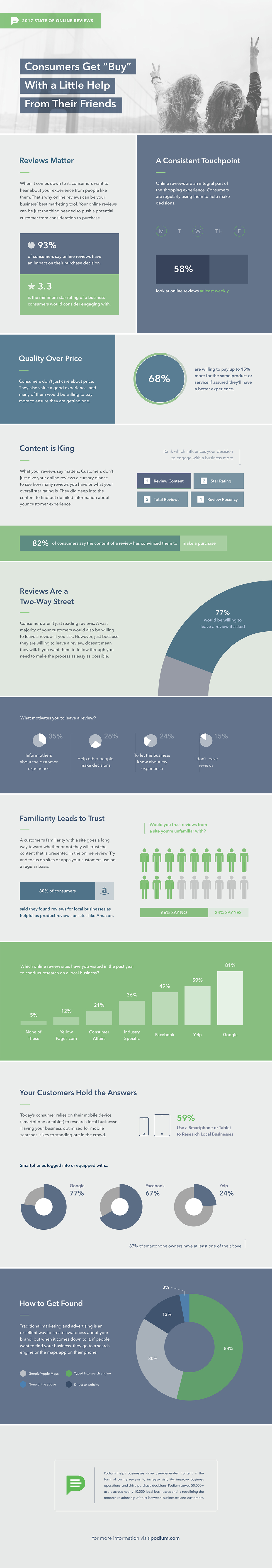
People tend to rely on the experience of others – 93% of consumers say online reviews influence their purchasing decisions. You can use social evidence to increase site conversion. Post information that will convince visitors that your product is worth ordering, for example:
– reviews by famous customers;
– product cases;
– a review of your product or service – it is better if it is in a video format, where you discuss the features, equipment, show the strengths of the goods;
– a section with links to articles about your company posted on thematic sites;
– the list and showcases of companies or people who are already using your product;
– awards, membership in niche organizations.
Simplify the Transaction Chain
Think about how to shorten the user’s path to the conversion action and remove unnecessary steps. Many clicks are a common usability error that scares off some potential customers. A good option is a one-click purchase. So the user does not waste time filling out countless fields – the manager will find out everything by phone. In addition, the client can be scared away by the fact that you need to leave a lot of personal data when placing an order, and a one-click purchase eliminates this and, accordingly, leads to the conversion of the site.
Button for Adding Product to a Wishlist
The bottom line is to give people the opportunity to save products that they liked, but for one reason or another, they are not ready to buy them now. Some of them will return to this list in the future and place an order.
Remove Distractions
The focus of the potential customer should be only the product and information that may affect the decision to purchase. Anything extra will do more harm than good. Consider the following tips:
– avoid the abundance of information elements in the design;
– do not use voluminous texts without obvious necessity;
– remove optional fields from forms;
– discard pop-ups;
– remove irrelevant images and links that lead to other pages.
The site page should be focused on one specific goal – conversion. You need to make sure that nothing interferes with the user on the path to achieving it.
Buttons, Widgets, Additional Elements
Automation is the key to a successful SME. That is why you should enhance management and automate operating functions. Particular attention must be paid to interactive elements on the website, that will allow:
– to involve the client more, to interest;
– provoke his response (feedback, suggestions);
– continue communication after a visit (for example, subscribing to a newsletter);
make a decision on the purchase of goods (for example, a promotional offer, a discount coupon).
Interactive elements include:
– buttons
– widgets
– pop-up (pop-up window);
– banners, etc.
A pop-up window may notify of a promotion or a hot offer. Including interactive elements can be used in marketing channels to re-attract customers. For example, push notifications are convenient because they come to the recipient’s desktop. Therefore, additional elements in the “push” can attract the attention of the recipient and provoke him to go to the site.
Final Word
By focusing on increasing conversions, instead of increasing your advertising budget linearly, you’ll improve your website’s performance and gain a competitive advantage. Conversion optimization work never ends. And if you are doing well with sales, this does not mean that indicators cannot be improved.


