
This blog has spent a lot of time on surveys lately.
There’s a post on how to write a great survey with just three questions. There’s another post on five ways to capture VOC data without a survey. You can even read about five signs your survey may be missing the point.
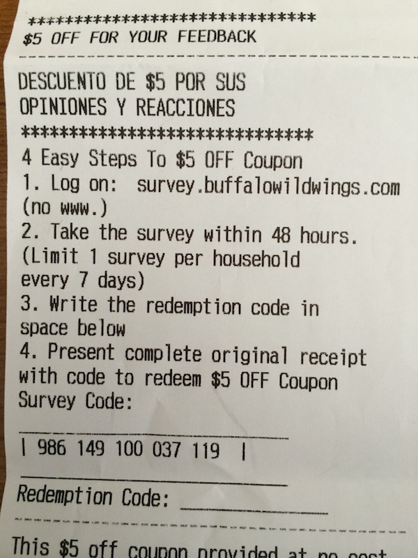
This post focuses on that last topic by giving you a detailed breakdown of a lousy customer service survey from Buffalo Wild Wings.
Tip: You’ll get more survey responses if you make it easy for people to respond.
Here’s the survey invitation. There’s no QR code and the survey site itself isn’t optimized for mobile, so guests are discouraged from completing the survey on their smart phones.
Tip: Don’t bother your customer with questions you should already know the answer to.
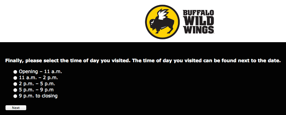
The survey asks a lot of questions that could easily be tied to the survey code or a customized survey link. Examples include the store, date visited, and the time of day. Each of these questions are on a separate screen which makes the survey even more tedious.
So far, we’re at 8 screens:
Tip: An annoyingly long survey will remind customers how annoyed they were already.
This survey is tedious! Customers don’t have the opportunity to share any feedback until they reach the 15th screen.
Tip: Cut out extra questions and give customers a comment box instead.
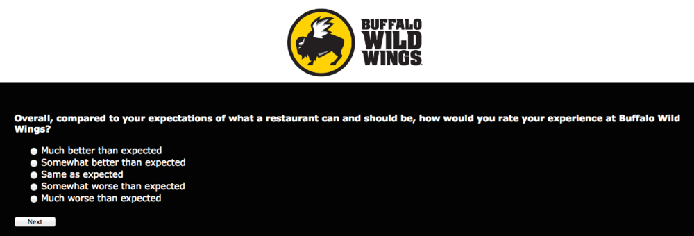
The survey also assumes it knows what’s driving customer dissatisfaction. The question in screen 15 (above) asks customers to provide an overall rating. The question in the screen below (screen #19 in the survey!) presumes to know what might drive customer satisfaction.
The danger is these questions might be irrelevant to the customer, but they’re required to complete the survey.
Tip: Keep questions to a minimum by avoiding repetition.
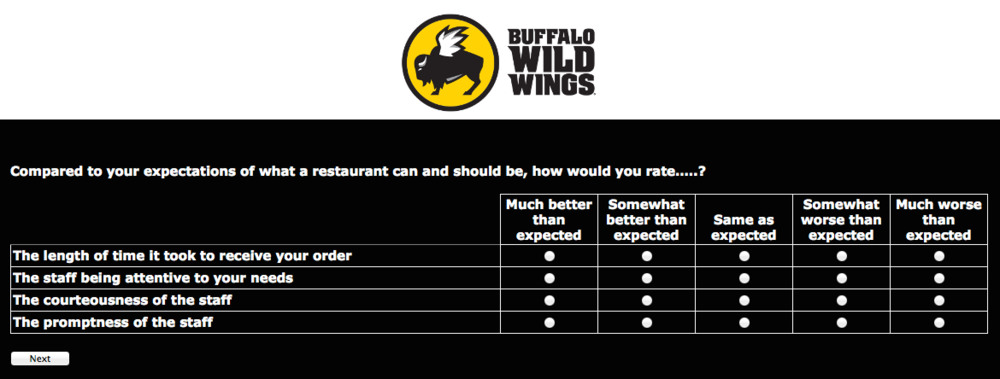
By now, the questions are starting to get repetitive. Didn’t someone in marketing check this survey before giving it the green light?
Here’s the question on Screen 15:
Overall, compared to your expectations of what a restaurant can and should be, how would you rate your experience at Buffalo Wild Wings?
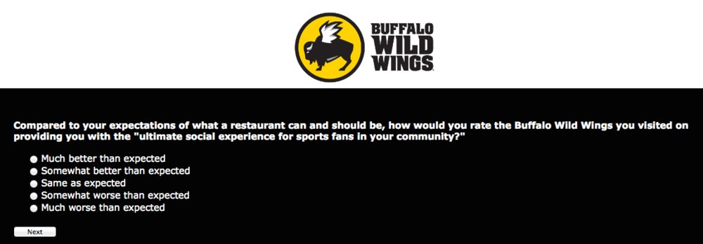
Here’s the question on Screen 26:
Compared to your expectations of what a restaurant can and should be, how would you rate the Buffalo Wild Rings you visited on providing you with the “ultimate social experience for sports fans in your community?”
Screen 26
Tip: Surveys should have a single purpose to give them razor-sharp focus.
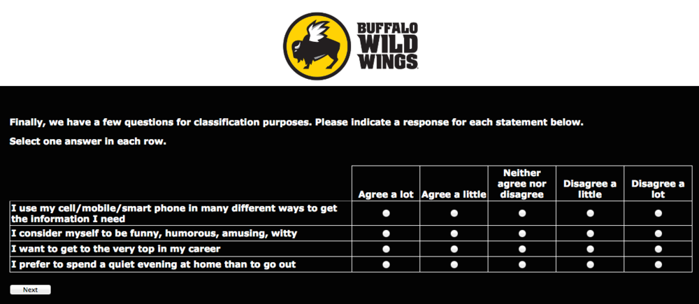
The questions just keep coming! Buffalo Wild Wings really makes you work for that $5 coupon. Now, they want to gather some demographic data.
It looks like someone in another department said, “Hey! You’re doing a survey? Can I add a few questions?” This is the 35th screen.
The final tally on this survey was a whopping 39 screens!
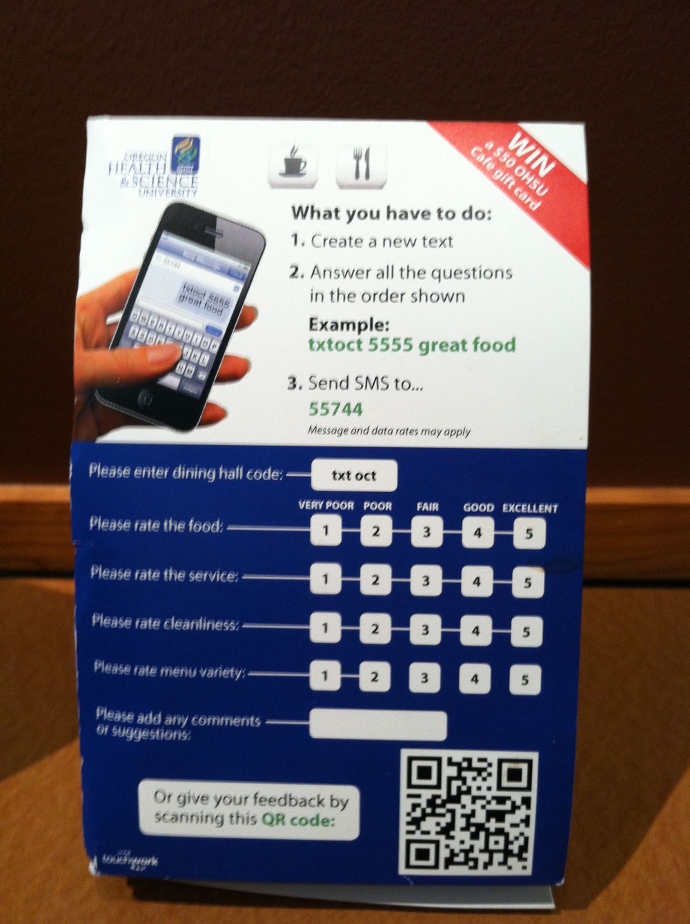
The effort required to complete it is a big turnoff. Here’s an example of a survey that’s far easier to complete. It’s limited to just five questions and customers are giving two options to access the survey.
(Please excuse the blurry picture.)
Note: My personal policy is to share negative feedback privately before naming a company in a blog post. Members of my party (including me) attempted to share our feedback with the store manager but he refused to come to our table.
In this case, I’m grateful for the poor service we received since their survey provides an excellent illustrative example.


