
The last time I wrote a post for Customer Think in March 2014, I was preparing readers for Google’s mobile site speed algorithm update. The search giant’s initiative to factor site speed into mobile search rankings was not just to encourage site owners to speed up their loading time, it was also to improve the overall mobile user experience.
Why? Let’s start with some facts in case you’ve been living under a rock. Mobile searches have surpassed desktop searches in Google, there are more mobile users than desktop users in the US and now mobile media consumption has outdone desktop consumption. With these stats in mind “if you’re not providing a satisfactory mobile experience you will miss out compared to competitors who are,” says Danyl Bosomworth on Smart Insights. I would add though in the context of customers, more than a satisfactory experience will be needed to convert.
If you own a business, here is how you’re going to make your customer journey 100% mobile:
Start On Site
Well we all know how this is going to end: making sure that all your brand touch points have a mobile counter-part, but this is especially true for your website. You’re dealing with people using small screens at the core of this conversation, so you have to get to the point.
Chandal Nolasco da Silva talks about ways to make website content mobile friendly on Search Engine Journal:
- Scale back site design
- Cut out a lot of content on the page that isn’t essential information
- Each page must have legible text
- Calls to Action should be clickable by touch
- If you have a mobile version of your website rather than a responsive site, you can actually write new headlines and titles that are shorter
- Adapt onsite photos by using a smaller version of the same photo or choosing new photos
- Banner images should be adapted with larger text or excluded
- Test and improve your site speed if necessary (warning: may require developers)
- Test conversion after mobile transition, if too low, tweak site again
Let me say that last one again, if conversion is too low, test again. This is so important. Often times creating a mobile site is as far as the strategy goes, without any thought for what the user experience is actually like. If your customer journey is to be 100% mobile-friendly you have to walk a mile in the customer’s shoes.
Never Forget Newsletters
Most smart phone users connect their email to their phone and even check emails on the go. Some people even set up push notifications so that every time they get a new email, their phone will alert them. If you’re sending email marketing newsletters on behalf of your brand, they better be responsive or mobile friendly, just like your website.
Pascale Guay, the CEO of Dialog Insight, talks about how to make sure your email newsletters are mobile friendly. She says “To optimize the mobile performance of your newsletters, you have to reduce the content and deliver one strong message. Once a client contacted me to understand why their latest e-newsletter wasn’t performing and I had to point out that the mobile user had to scroll 5 pages to get to the main point! This client now understands the value of having one clear and concise message.”
Just like with your website, email newsletters have to scale back, cut out and create clear calls to action. But don’t stop there. Electronic newsletters can be easily personalized. Go the extra customer mile and send personalized and targeted correspondence. You can do this by creating segments to send personalized/targeted email messages based on the user’s mobile behaviour. However this depends on the data that you have about your customers. When a customer receives a message that shows you know who they are, they will feel appreciated and their brand loyalty will likely be reinforced.
Better Cover Brick and Mortar
The invention of the QR code brought about the first instance of connecting the physical and mobile customer experience. The now passé QR code could be displayed outside a business so any smart phone user who hovered over it with their phone camera it would be taken directly to the business’ website or a landing page with a discount for example.
Today the connection and opportunity between in-store and the mobile customer has evolved significantly. Up to 80% of text messages are opened by mobile users, meaning if executed properly, brands can connect with their customer via SMS for example. Geolocating customers and sending them text prompts with discounts when they’re in your store’s vicinity is just the beginning.
Google reported that 84% of smartphone shoppers will use their phone while they are in a store. They also reported that 8 out of 10 of these people were using their mobile phones to help with their shopping in store. This is a huge opportunity for retailers. In Google’s report they found that mobile phones were a tool that empowered shoppers, for example some used their phones to compare prices, while others searched online for similar products.
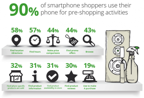
Screenshot via Google Research
Nowadays it’s not just the Apple Store who has created a truly mobile in-store customer experience by allowing customers to checkout using an iPad for example. Even my local convenient store/sandwich maker uses an iPad to process customer payments from credit cards.
You may choose to adopt a few mobile in-store inspirations, or you could aim to make the entire experience mobile-friendly – it really depends on the type of customers you have. Some people prefer to not be bothered by sales agents and would prefer to interact digitally even while in store. Others will want the support of an agent, but it doesn’t mean they will turn down a 10% discount code sent via SMS to them as they enter your store. The point is that there are many different ways to make the in-store experience mobile-friendly and take advantage of this touch point, but not all of the options available are necessarily the right fit for your brand. You could always survey customers in-store and online to see what types of mobile in-store features they would be interested in receiving.
Final Thoughts
Brands will prioritize different touch points, but the customer won’t discriminate. Ask a friend or a mystery shopper to test and evaluate the mobile experience you’re providing. Take them through all the steps and all the mediums in which you interact with customers on their phone or tablet. Have them sign up to your newsletter, leave feedback on a website form, even a full checkout – I mean everything! You can even do smaller initiatives like setting up Google Business page earning you a spot on Google Maps, helping your customer find you more efficiently on the go. Don’t stop testing until your site, e-newsletter, in-store experience and every single brand touch point is mobile-friendly. Your customers and their small screens will thank you!


Thanks for the insightful overview of how to optimize shopping on mobile devices. You offer very practical tips and also thought-provoking suggestions. I appreciate also your remarks on testing. In fact, it’s remarkable how many brands including the bigshots have websites that are marred by glitches and fails when viewed on my phone. That’s why testing is oh so important. A quick remedy that might help everyone enhance their customers’ mobile experience and safeguard their brand is testing at an easy online testing lab like Mobilizer. In about 30 seconds, you can spot-check how your website displays on leading phones and tablets. In fact, here’s how Customer Think appears in a test: https://app.mobile1st.com/mobilizer/#/view/kisR Pretty darn good, I say.
Hey Rick, thanks for reading and for your feedback! Agreed 100% testing is THE most important and often overlooked factor in making touch points mobile friendly. The Mobile1st tester is pretty cool, I’d never seen it before. Am definitely going to be using this in the future! Cheers