

Anscombe’s quartet
Here are some interesting numbers for you. Interesting in a geeky sort of way…
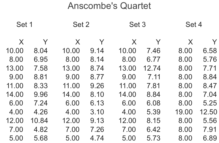
They are 4 sets of readings for two variables, X and Y.
That is a horribly algebraic. It brings back memories of a comprehensive school deep in the 1980’s. All polyester blazers and fermenting gym kit. Let me bring the X’s and the Y’s a little more up to date:
- X versus Y
- Sales rate versus call handle time
- Information collected versus first time fix
- Quality versus cost
There are lots of X’s and Y’s in business. My time in Mr Gilpin’s maths class wasn’t wasted.
The question
Are these X’s and Y’s different or are they the same. How do they relate to each other?
In the world of big data and analytics (when did analysis become a noun?) the solution is easy to find, draw up some “descriptive statistics”. Summarise the data so that you can look at it.
Nothing to see here
I have saved your spreadsheet blushes and calculated the statistics for you. Here they are…
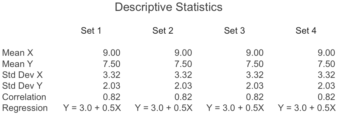
What do they say?
- The mean of X and the mean of Y — all four are the same.
- The standard deviation of X and the standard deviation of Y — all four are the same.
- The correlation between X and Y — all four are the same.
- The regression equation for X and Y — all four are the same.
So there you have it, the 4 groups of X’s and Y’s are all the same. Nothing has changed, there is nothing to worry about.
Or is there?
If I draw some scatter plots the data sets look very different.
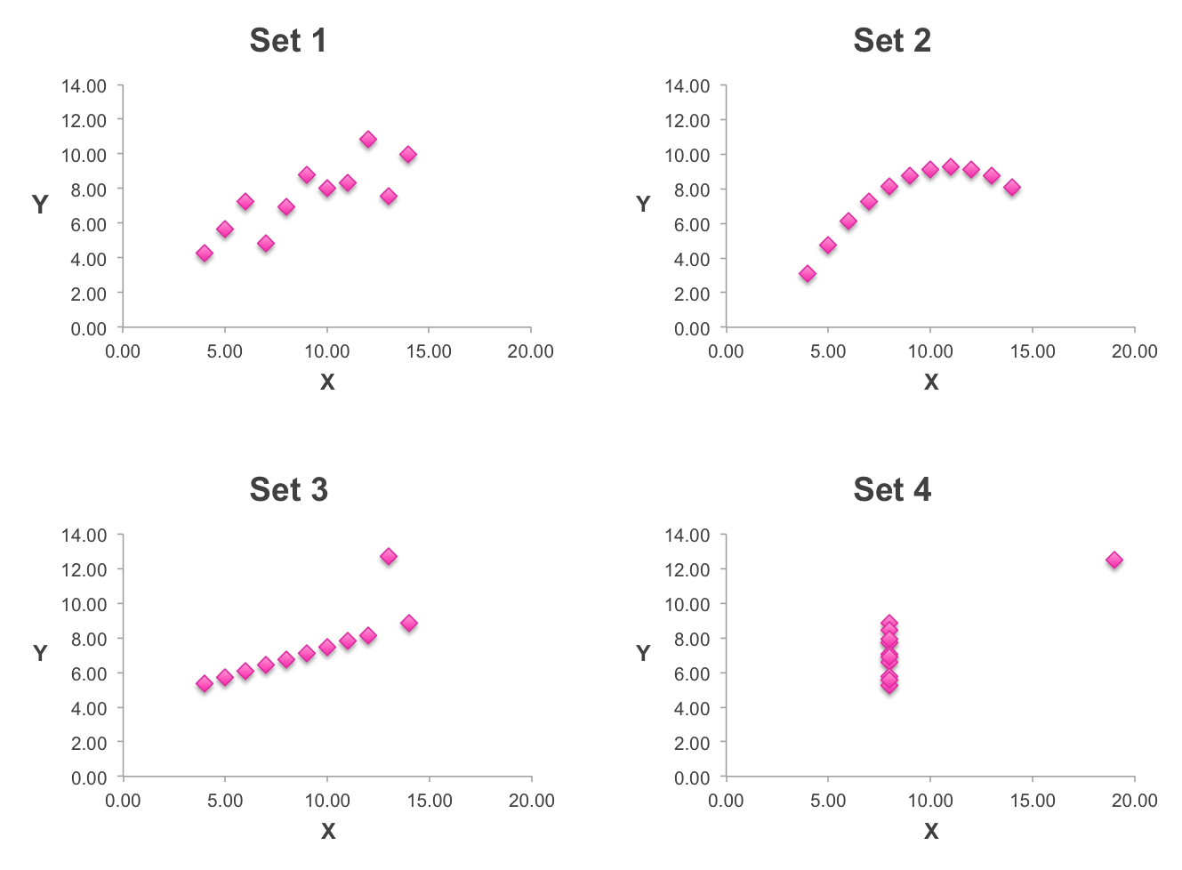
The point of the story
If you want to understand what is going on in your business, don’t rely on the accountants and analysts with their beautiful tables of numbers. Draw some graphs and look at the data instead.
Better still, go and have a look at the shop floor. It will be far more interesting than your maths class ever was.
If you enjoyed this post click here to receive the next

Read another opinion
Image by Blondinrikard Fröberg


This is an absolutely delightful post using a clever way to make an important point. It reminds me of a great piece I read in the ’70’s on “Salt Passage Research.” http://bit.ly/2GRGyjB. But the best warning about the illusion of stats to communicate the truth comes from John Steinbeck’s book Sea of Cortez, in which he describes a fishing expedition off the coast of Los Cabos, Mexico in this way:
“The Mexican sierra has 17 plus 15 plus nine spines in the dorsal fin. These can easily be counted. But if the sierra strikes hard on the line so that our hands are burned, if the fish sounds and nearly escapes and finally comes in over the rail, his colors pulsing and his tail beating in the air, a whole new relational externality has come into being-an entity which is more than the sum of the fish plus the fisherman.
The only way to count the spines of the sierra unaffected by this second relational reality is to sit in a laboratory, open an evil-smelling jar, remove a stiff colorless fish from the formalin solution, count the spines and write the truth. There you have recorded a reality which cannot be assailed-probably the least important reality concerning either the fish or yourself.”
I have fished for Mexican Sierra off the coast of Los Cabos and I can verify his accurate description of the experience, despite what the research may report.
Thanks, James for your great work on this! May never make a Type 2 error and always remain a few standard deviations away from the mean of the gullible crowd!!
Once again, making the case for understanding the differences between correlation/regression (simple or multiple) and the causation, or qualitatively and quantitatively drawn real drivers of results. Maybe it shouldn’t be so surprising to me that, even with so much evidence to challenge use of correlation data, so few analysts and companies seem to comprehend this.
Interesting read, you summed it up well. Data visualization is crucial in developing a practical statistical model, but just as statistics, data visualization can be misinterpreted or misrepresented because users may not understand the fundamental concerns with charts, graphs and maps that apply to their world.
Thank you for the comments, glad you enjoyed the post.
Chip, in England we have sticklebacks, and as any schoolboy with a net knows, they are about half an inch long and have either 3 or 5 spines on the dorsal fin. Perhaps the Mexican Sierra is its bigger brother… Great story.
Great article, well stated. A few years ago, I read an observation, “statistics aren’t facts, they’re interpretations.” I don’t know who wrote it, but I never forgot the idea. Since then, whenever I read a statistic, the first question I ask myself is ‘what is the point the writer is attempting to prove or reinforce?’ Then, I seek to understand what his or her vested interest is. I often find one.
A good book on the topic is A Field Guide to Lies – Critical Thinking in the Digital Age by Daniel Levitin. I recommend it to anyone who considers statistics when making decisions.