A successful customer experience management (CEM) program requires the collection, synthesis, analysis and dissemination of customer metrics. Customer metrics are numerical scores or indices that summarize customer feedback results for a given customer group or segment. Customer metrics are typically calculated using customer ratings of survey questions. I recently wrote about how you can evaluate the quality of your customer metrics and listed four questions you need to ask, including how the customer metric calculated. There needs to be a clear, logical method of how the metric is calculated, including all items (if there are multiple items) and how they are combined.
Calculating Likelihood to Recommend Customer Metric
Let’s say that we conducted a survey asking customers the following question: “How likely are you recommend COMPANY ABC to your friends/colleagues?” Using a rating scale from 0 (not at all likely) to 10 (extremely likely), customers are asked to provide their loyalty rating. How should you calculate a metric to summarize the responses? What approach gives you the most information about the responses?
There are different ways to summarize these responses to arrive at a customer metric. Four common ways to calculate a metric are:
- Mean Score: This is the arithmetic average of the set of responses. The mean is calculated by summing all responses and dividing by the number of responses. Possible scores can range from 0 to 10.
- Top Box Score: The top box score represents the percentage of respondents who gave the best responses (either a 9 and 10 on a 0-10 scale). Possible percentage scores can range from 0 to 100.
- Bottom Box Score: The bottom box score represents the percentage of respondents who gave the worst responses (0 through 6 on a 0-10 scale). Possible percentage scores can range from 0 to 100.
- Net Score: The net score represents the difference between the Top Box Score and the Bottom Box Score. Net scores can range from -100 to 100. While the net score was made popular by the Net Promoter Score camp, others have used a net score to calculate a metric (please see Net Value Score.) While the details might be different, net scores take the same general approach in their calculations (percent of good responses – percent of bad responses). For the remainder, I will focus on the Net Promoter Score methodology.
Comparing the Customer Metrics
To study these four different ways to summarize the “Likelihood to recommend” question, I wanted to examine how these metrics varied over different companies/brands. Toward that end, I re-used some prior research data by combining responses across three data sets. Each data set is from an independent study about consumer attitudes toward either their PC Manufacturer or Wireless Service Provider. Here are the specifics for each study:
- PC manufacturer: Survey of 1058 general US consumers in Aug 2007 about their PC manufacturer. All respondents for this study were interviewed to ensure they met the correct profiling criteria, and were rewarded with an incentive for filling out the survey. Respondents were ages 18 and older. GMI (Global Market Insite, Inc., www.gmi-mr.com) provided the respondent panels and the online data collection methodology.
- Wireless service provider: Survey of 994 US general consumers in June 2007 about their wireless provider. All respondents were from a panel of General Consumers in the United States ages 18 and older. The potential respondents were selected from a general panel which is recruited in a double opt-in process; all respondents were interviewed to ensure they meet correct profiling criteria. Respondents were given an incentive on a per-survey basis. GMI (Global Market Insite, Inc., www.gmi-mr.com) provided the respondent panels and the online data collection methodology.
- Wireless service providers: Survey of 5686 worldwide consumers from Spring 2010 about their wireless provider. All respondents for this study were rewarded with an incentive for filling out the survey. Respondents were ages 18 or older. Mob4Hire (www.mob4hire.com) provided the respondent panels and the online data collection methodology.
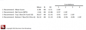
Table 1. Correlations among different summary metrics of the same question (likelihood to recommend).
From these three studies across nearly 8000 respondents, I was able to calculate the four customer metrics for 48 different brands/companies. Companies that had 30 or more responses were used for the analyses. Of the 48 different brands, most were from the Wireless Service provider industry (N = 41). The remaining seven were from the PC industry. Each of these 48 brands had four different metrics calculated on the “Recommend” question. The descriptive statistics of the four metrics and the correlations across the 48 brands appear in Table 1.

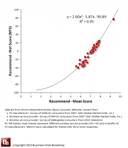
Figure 1. Scatterplot of two ways to summarize the “Likelihood to Recommend” question (Mean Score and Net Score (NPS)) for the Recommend Question
As you can see in Table 1, the four different customer metrics are highly related to each other. The correlations among the metrics vary from .85 to .97 (the negative correlations with Bottom 7 Box indicate that the bottom box score is a measure of badness; higher scores indicate more negative customer responses).
These extremely high correlations tell us that these four metrics tell us roughly the same thing about the 48 brands. That is, brands with high Mean Scores are those that are getting high Net Scores, high Top Box Scores and Low Bottom Box scores. These are overly redundant metrics.
When you plot the relationship between the Mean Scores and Net Scores, you can clearly see the close relationship between the two metrics (see Figure 1.). In fact, the relationship between the Mean Score and NPS is so high, that you can, with great accuracy, predict your NPS score (y) from your Mean Score (x) using the regression equation in Figure 1.
Mean Score vs Net Promoter Score vs Top/Bottom Box
The “Likelihood to Recommend” question is a commonly used question in customer surveys. I use it as part of a larger set of customer loyalty questions. What is the most efficient way to summarize the results? Based on the analyses, here are some conclusions regarding the different methods.
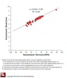
Figure 2. Scatterplot of two ways to summarize the “Likelihood to Recommend” question (Net Score (NPS) and Mean Score) for the Recommend Question
1. NPS does not provide any additional insight beyond what we know by the Mean Score. Recall that the correlation between the Mean Score and the NPS across the 48 brands was .97! Both metrics are telling you the same thing about how the brands are ranked relative to each other. The mean score uses all the data to calculate the metric while the NPS ignores specific customer segments. So, what is the value of the NPS?
2. NPS score is ambiguous/difficult to interpret. An NPS value of 15 could be derived from a different combination of promoters and detractors. For example, one company could arrive at an NPS of 15 with 40% promoters and 25% detractors while another company could arrive at the same NPS score of 15 with 20% promoters and 5% detractors. Are these two companies with the same NPS score really the same?
Also, more importantly, the ambiguity of the NPS lies in the lack of a scale of measurement. While the calculation of the NPS is fairly straightforward (e.g., take the difference of two values to arrive at a score), the score itself becomes meaningless because the difference transformation creates an entirely new scale that ranges from -100% to 100%. So, what does a score of zero (0) indicate? Is that a bad score? Does that mean a majority of your customers would not recommend you?
Understanding what an NPS of zero (0) indicates can only occur when you map the NPS value back to the original scale of measurement (0 to 10 likelihood scale). A scatterplot (and corresponding regression equation) of NPS and Mean Score is presented in Figure 2. If we plug zero (0) into the equation, your expected Mean Score would be 7.1, indicating that a majority of your customers would recommend you (mean score is above the midpoint of the rating scale). If you know your NPS score, you can estimate your mean score using this formula. Even though it is based on a narrowly defined sample, I think the regression model is more a function of the constraints of the calculations than a characteristic of the sample. I think it will provide some good approximation. If you try it, let me know how how accurate it is.
3. Top/Bottom Box provides information about clearly defined customer segments. Segmenting customers based on their survey responses makes good measurement and business sense. Using top box and bottom box methods helps you create customer segments (e.g., disloyal, loyal, very loyal) that have meaningful differences across segments in driving business growth. So, rather than creating a net score from the customer segments (see number 2), you are better off simply reporting the absolute percentages of the customer segments.
Summary
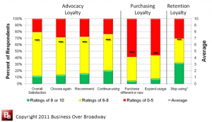
Figure 3. Reporting loyalty results using mean scores and top/middle/bottom box scores (customer segments).
Communicating survey results requires the use of summary metrics. Summary metrics are used to track progress and benchmark against loyalty leaders. There are a variety of ways to calculate summary metrics (e.g., mean score, top box, bottom box, net score), yet the results of my analyses show that these metrics are telling you the same thing. All metrics were highly correlated with each other.
There are clear limitations to the NPS metric. The NPS does not provide any additional insight about customer loyalty beyond what the mean score tells us. The NPS is ambiguous and difficult to interpret. Without a clear unit of measurement for the difference score, the meaning of an NPS score (say, 24) is unclear. The components of the NPS, however, are useful to know.
I typically report survey results using mean scores and top/middle/bottom box results. I find that combining these methods help paint a comprehensive picture of customer loyalty. Figure 3 includes a graph that summarizes the results of responses across three different types of customer loyalty. I never report Net Scores as they do not provide any additional insight beyond the mean score or the customer segment scores.


Bob, thanks for these great examples and the analysis.
A few years ago when I was digging into the NPS debate, I wrote this in an article
It seems to me that, despite its flaws, NPS works about as well as other approaches. And companies believe in it, so they act on what it tells them — assuming they ask more questions, of course.
NPS doesn’t add any value as a metric over mean satisfaction score, but perhaps the belief system behind NPS and the willingness to drive the organization forward is worth something. Something that simple satisfaction measures or more complicated loyalty metrics have struggled to achieve.
As I recall, one of the prime examples that Reichheld used in this his pre-NPS days was Enterprise, the car rental company. They used (and I think still do) a top-box methodology on a 1-5 satisfaction scale, and focused on driving that top box score up, up, up! It worked, and I suspect it would for other companies too.
Maybe it’s easier to buy into NPS because it’s just a more interesting name. Who wouldn’t want to get more “promoters” vs. just getting higher levels of satisfaction? Perhaps not the best science, but very effective psychology!
Michael, I agree there are more precise ways to assess loyalty. But I think one of the things that appeals to people is that NPS is easy to calculate. One question and simple math.
You say advocacy is a “straightforward” metric (among other things.). If so, can you describe how someone can calculate it in a sentence or two?
I’m not saying that we should dumb things down, but can we find a middle ground of simple + effective? To be candid, much as I like your argument for using advocacy — a nice word that really captures how we’d like customers to feel — I could not describe it to someone else in a way they could use it.
Also, can you share any example of companies that have accepted and adopted this approach?
…..beggars would ride.” In other words, just because something is easy to calculate, that shouldn’t be its principal criterion for use as a metric. More than equal considerations should be whether the metric is a real world, contemporary, and actionable (in terms of financial outcomes) approach for segmenting customers, and analyzing them, based on behavior. Advocacy offers that framework, for our clients who feel that their current approaches could more closely and definitively provide customer insights which link to business performance.
So, that said, what is customer advocacy? As we define it, the basic framework for advocacy measurement identifies the level of customer involvement in a product or service through brand favorability and post-experience positive/negative offline and online word-of-mouth. In our question battery, we also include brands of current use and future consideration. From this, we can classify each customer into one of four advocacy groups.
Companies in multiple industries, and on multiple continents, are now actively utilizing customer advocacy measurement as a core performance metric. Financial services is probably the most visible industry using customer advocacy, but it is seen among many of our clients. This is a competitive advantage for our clients, so we only reveal which is using the metric if they specifically authorize us to give their names on request.
Michael, your approach to assessing advocacy certainly sounds robust. However, I wouldn’t use the word “straightforward” to describe it.
Do you have any comparisons you can share on how your advocacy measurement compares to NPS? Or how it is more actionable?
I’m afraid that many people are daunted by the complexity of loyalty research. But more would invest if they understood what a more complex/custom analysis would give them. Otherwise, it’s just easier to equate NPS “promoters” as “advocates.”
Bob –
I’m always glad to provide metric for metric comparison examples, where they are available. Here is one taken directly from Chapter 6 of my 2011 book, The Customer Advocate and The Customer Saboteur:
“Advocacy behavior isn't the same as promotion (recommendation), nor is promotion the same as advocacy behavior. The accuracy of the statement just made has been proven in multiple research studies. In a 2010 national study among customers of the fifteen largest banks in the United States,it was found that 90% of the customers identified as advocates were in the highest category of customers when the single-number recommendation metric was applied, while only 56% of these high single-number metric customers were found to be advocates. In the same study, results showed that the highest group of single-number customers were 1.8 times more likely to open new accounts at their primary bank when compared to the lowest group of single-number customers; however, using the advocacy framework, the advocates were 2.8 times more likely to open new accounts when compared to the antagonists (alienateds), the lowest performing group of advocates.”
Recognizing that the term ‘advocacy’ is coming into more active use among marketers and researchers, the purveyors of NPS have not hesitated to annex and usurp advocacy and use it as a surrogate for recommendation. You have recognized this, and the ease of accepting the perspective of equality, in the concluding point of your last reply. In reality, the two concepts are in no way equal, nor, as illustrated by the above example (and many others) does their application produce similar results. The difference between the perfornmance level of promoters/detractors relative to advocates/alienateds in the banking example is +55% in favor of the advocates. This is not only non-identical, it isn’t even similar.
While NPS is a single number, aggregated metric with application challenges (as Bob Hayes has echoed and amplified in his piece), the advocacy framework really consists of only four simple questions. This is hardly what I would consider complex, especially relative to some of the ten to fifteen element ‘black box’ loyalty models now being offered. Further, it is the only framework which considers the effect of offline/online word-of-mouth and brand favorability in customer decision-making behavior.
I’m intrigued. What are the 4 questions?
……questions addressing
1. customer favorability of brand
2. future brand consideration
3. existence, and intensity/frequency, of positive and negative brand buzz
4. distribution, by brand, of most recent purchases
For additional insight, we may also ask about use of online and offline social networks, and level/intensity of brand support.
Note that recommendation is not part of this. From results such as were presented in the last reply, we have long since determined that recommendation actually diminishes the accuracy and actionability of our findings. That said, we often work with clients who actively use the recommendation score as their core metric; and, through application of our framework and the analytical content it provides, we can help them achieve higher recommendation score results.
I can point you, and CustomerThink readers, to impressive customer advocacy research findings, in multiple industries and in geo areas around the world.
Thanks for that, the questions make sense.
However, I find it quite interesting that recommendation (e.g. “How likely are you to recommend…?”) is not a question used at least in part to assess advocacy.
Advocacy means “active support, esp of a cause.”
And an advocate is “a person who speaks or writes in support or defense of a person, cause, etc.”
It seems to me that willingness to make a recommendation (or better yet, actually making a recommendation) would be one way to assess “active support” or “defense” of a company, product or service that someone really liked.
And isn’t this sort of WOM behavior what drives business outcomes? Recommendations = free marketing!
We tested the framework with and without the recommendation likelihood question. While, intuitively, it would appear to make sense that actual recommdation would at least be a neutral, and hopefully positive, component of advocacy behavior, in proof of results it is neither. My own research for multiple clients into this seeming contradiction, conducted before assuming my current role, generated the identical result. In every b2b and b2c industry studied (close to 20), evidence of actual positive or negative recommendation occurred with far less frequency than positive or negative WOM. Further, impact of WOM on downstream consumer behavior was stronger than recommendation in most industries, and equal in others. When the ‘likelihood to recommend’ modifier was added into the mix, this undercut behavior and impact even more.
Your points and questions are very similar to those I had when first conducting advocacy research almost a decade ago. But, again, advocacy and recommendation likelihood are different metrics and concepts, yielding different results. Our clients want actionable research approaches that most contribute to higher sales and profits. Advocacy does that.
Wim Rampen’s new blog, which I just read and commented on, illustrates some of the recommendation question challenges encountered in the real world: http://www.customerthink.com/blog/sorry_nps_i_m_not_buying_it
Bob (Hayes) –
Agree with all of your conclusions: “There are clear limitations to the NPS metric. The NPS does not provide any additional insight about customer loyalty beyond what the mean score tells us. The NPS is ambiguous and difficult to interpret. Without a clear unit of measurement for the difference score, the meaning of an NPS score (say, 24) is unclear. The components of the NPS, however, are useful to know.” Many of the challenges and analytical limitations, however, are not owned up to by either the providers, or many of the users of NPS.
So, while not having major questions with the utility of NPS components (at least on a macro basis), the key question – for enterprises, marketers, and analysts – continues to be, is likelihood to recommend the most straightforward, contemporary, real-world, and actionable metric on which to base performance effectiveness and improvement? An alternative, and increasingly accepted, framework exists in the form of customer advocacy measurement:
http://www.customerthink.com/article/customer_advocacy_behavior_personal_brand_connection
http://www.customerthink.com/article/marketing_case_customer_advocacy_measurement
http://www.customerthink.com/article/negative_word_of_mouth_customer_alienation_and_sabotage
Thanks for helping clear out the cobwebs in my thinking!
It’s easy (and sloppy) to equate recommendation with advocacy. But if I understand correctly from these statements…
… you’re saying that Word of Mouth (WOM) behavior is what determines Advocacy. And WOM is not necessarily just saying “I recommend company X or product Y” hence asking the NPS-style question may not be the best choice.
WOM is a pretty general term that (to me at least) just means saying something about a company/product to another party. Could be positive, negative or neutral. So a consumer could say something like “this is really a great product” but not necessarily mean “you should buy it.” Or, “this is company has terrible customer service” without necessarily recommending that a friend steer clear of it.
And of course, some WOM could just be informational, without a positive or negative sentiment.
Can you share any more detail on specific types of WOM behavior that drive customer loyalty or other good business outcomes?
Bob –
Brand-related positive and negative WOM, and the frequency/volume with which these informal communications occur, is one of the key elements behind advocacy. In the statement you quote, I was citing research in which I looked ONLY at the downstream behavioral impact of online and offline word-of-mouth relative to recommdendation. On that singular element, word-of-mouth’s behavioral impact was stronger than recommendation. When the other elements which make up advocacy behavior are added into the mix, the differences between advocacy and recommendation behavior move beyond merely significant to become dramatic.
So, as described, advocacy is more than WOM. Our framework covers WOM, brand favorability, and two other major contributing factors. All of these, combined into a proven framework, are what we and leading consulting organizations identify as making up the drivers of advocacy behavior.
As you note, a lot of online and online WOM is not brand-related. It’s what social scientists call ‘phatic’ communication, i.e. just general conversation. We are only concerned with communication around brands with which consumers have had specific experience.
This is useful dialogue for all CustomerThink readers; and, if I might suggest, now might be an opportune time for you and I to do an “Inside Scoop” interview around this topic.