
Most websites are brochures on a screen. Which is kind of silly, given that the visitor is more than happy to click around, take advantage of offers, and even answer a few questions, if you ask at the right time and in the right way. Website engagement is the new frontier.
I recently came across Kettle & Fire. The site is solid all by itself, but the numerous ways they engage with the visitor provide a perfect example for anyone wanting to succeed at digital marketing.
Here is the home page. Note how many opportunities they give you to click, including that top banner that invites you to get “40% savings NOW.” Then, a few lines down, after telling you exactly what they sell, you are invited to “View Our Products.”
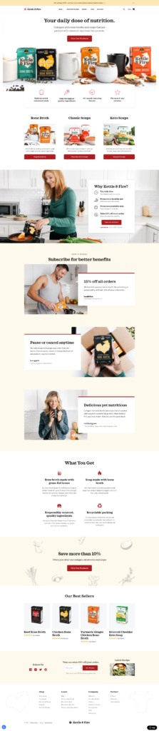
The rest of the page shows a series of “proof of what we promise” sections; more chances to save; ways to add convenience to your shopping experience; and more about their products.
A top-notch site, but it’s all the opportunities for interaction that really impressed me.
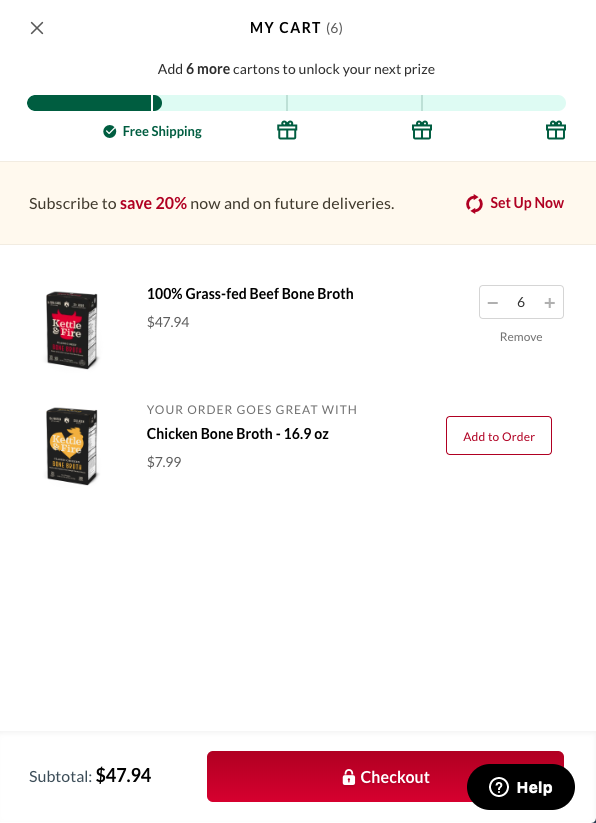
The shopping cart
In this one window, there are four opportunities to engage further. You can “Add 6 more cartons to unlock your next prize,” you can “Subscribe to save 20% now and on future deliveries,” you can add Chicken Bone Broth to your order; you can check out; and you can get help (this help button appears on every page throughout). You can also see that you have already “earned” free shipping with the thermometer on top.
Anything preventing you from ordering?
As you are looking around, a small popup appears—in the lower left, so it is out of the way—asking “Is there anything preventing you from ordering at this point?” I started to type in “I just want . . . “ and stopped, realizing I wanted to capture this popup. So that is what you see. Note that Hotjar is the app behind this popup; Hotjar is an app that helps you see buyer journeys via heat maps, and (obviously) also other tools such as popup surveys.
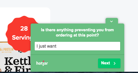
Why not ask a buyer this question? What if you can help them as they are clicking around?
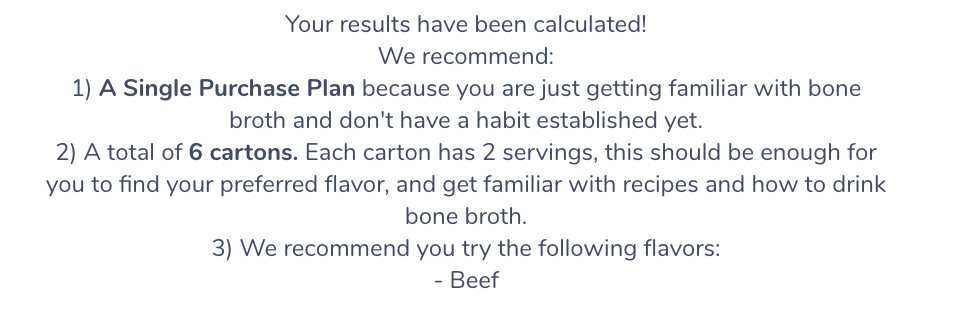
Take the quiz
One of the top nav choices is “Bone Broth Quiz.” When you get there, you see this screen:
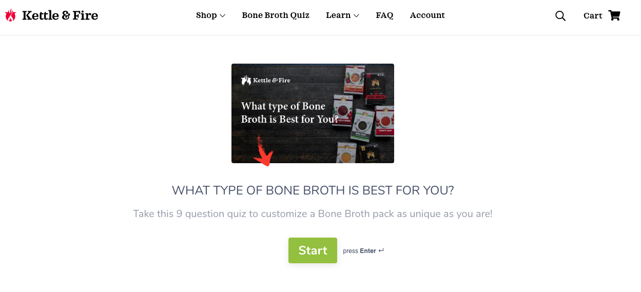
This screen immediately asks a question that is very “you”-oriented: “What type of bone broth is best for you?” Once you have answered all their questions about your ingredient preferences, how you’ve heard of them, how familiar you are with bone broth, they give you a set of recommendations:
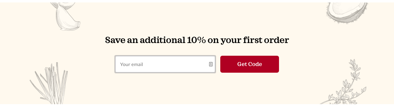
The Kettle & Fire site makes numerous invitations to “save,” including a “Save an additional 10% on your first order” banner on the home page. The price you pay for this is giving them your email, which doesn’t feel like a burden because you get to save 10% on your first order, and you know that if you do order, they’re going to get your email anyway.
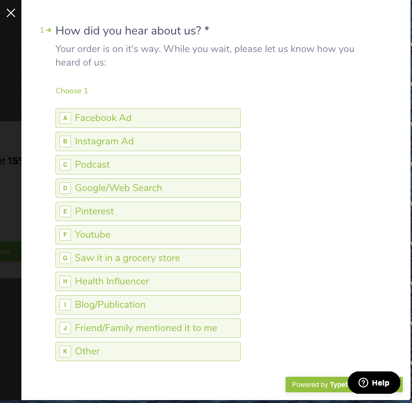
How did you hear about us?
Kettle & Fire is rather obsessive about figuring out which of their marketing efforts are working. This popup popped up right after I completed my order. Clever copywriting to say, “Your order is on it’s way. While you wait, please let us know how you heard of us:” Yes, “it’s” should be “its,” but that is a nit. Their list is pretty thorough. And there is an option at the end to say, in your own words, where you heard of them; “Other” opens up a text box you can type into.
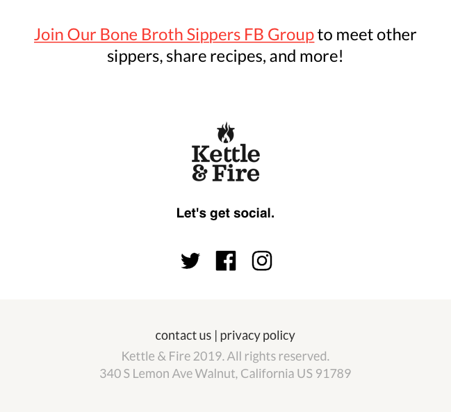
Join us
Another invitation was offered on the site. You can “Join Our Bone Broth Sippers FB Group to meet other sippers, share recipes, and more!” So they are selling more than just broth; they are giving you a way to join a community of people with whom you have something in common (their product!).
Urgent Savings Message
At some point during my visit, I was invited to take 15% off “for the next 20 minutes only.” The popup shows numbers counting down the minutes and seconds. Nothing like injecting a bit of urgency into the buying process.

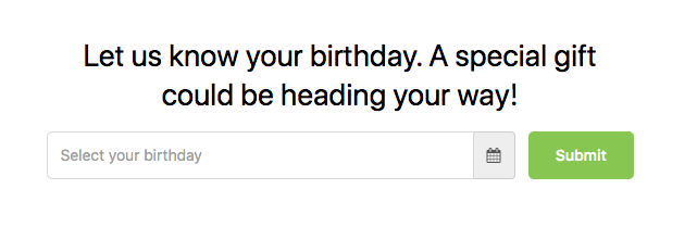
What’s your birthday?
Obviously, this wouldn’t work for a B2B product, and some might consider this intrusive (in which case, you don’t have to answer). But it’s interesting that they are using this method to 1) offer a gift and 2) give themselves yet another opportunity to engage with customers.
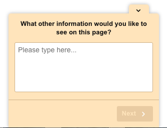
What information would you like to see?
This is brilliant. You’re on the home page or another page, and this small screen pops up in the lower left (note that it doesn’t appear over the page copy). I can’t tell you how many buyers have told me that they are disappointed with the information that they don’t find on websites when they go looking. There’s a lot of vague, useless marketing blah blah on websites that completely ignores the specific questions that people have when they visit a site.
This is a great way to find out what their visitors really want to know.
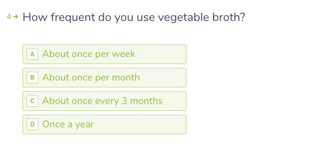
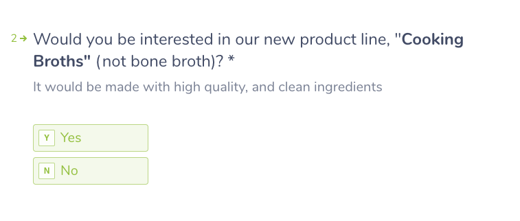
More surveys
Another survey that was offered asked, “How frequent [sic] do you use vegetable broth?” In spite of the typo, I’m sure they learn more about their customers with this question. They also asked if you’d be interested in their new product line. Golly, these guys are serving up chances for interaction and engagement every few seconds on this site.
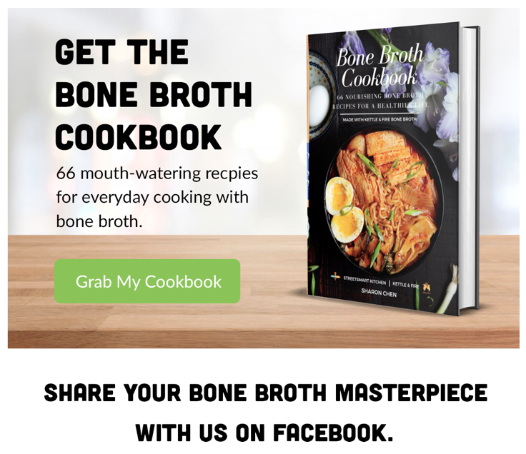
More offers
They offer a cookbook, which makes perfect sense, but they also offer visitors a chance to “Share your bone broth masterpiece with us on Facebook.”
There’s more—believe it or not! The interactivity and engagement extend to the email you get after you order, where they give you a big thank you:
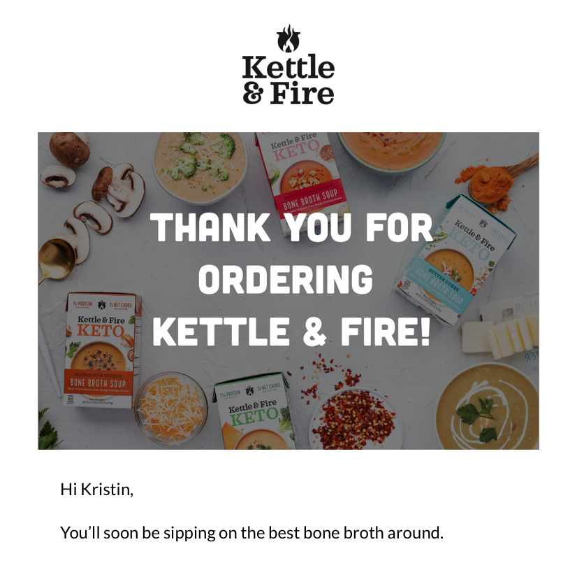
The email text continues on to provide tracking information, an invitation to buy the cookbook, and to share your recipes on Facebook.
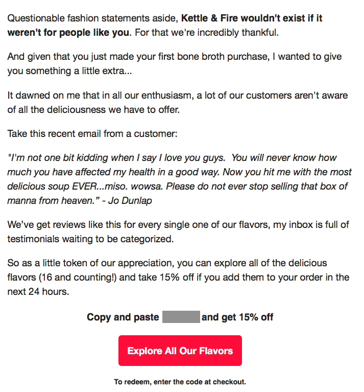
A more personal email
In addition to the order confirmation email, I got an email from their “support” email address, and opened it to find a rather personal and somewhat startling email from Justin, one of the co-founders of Kettle & Fire.
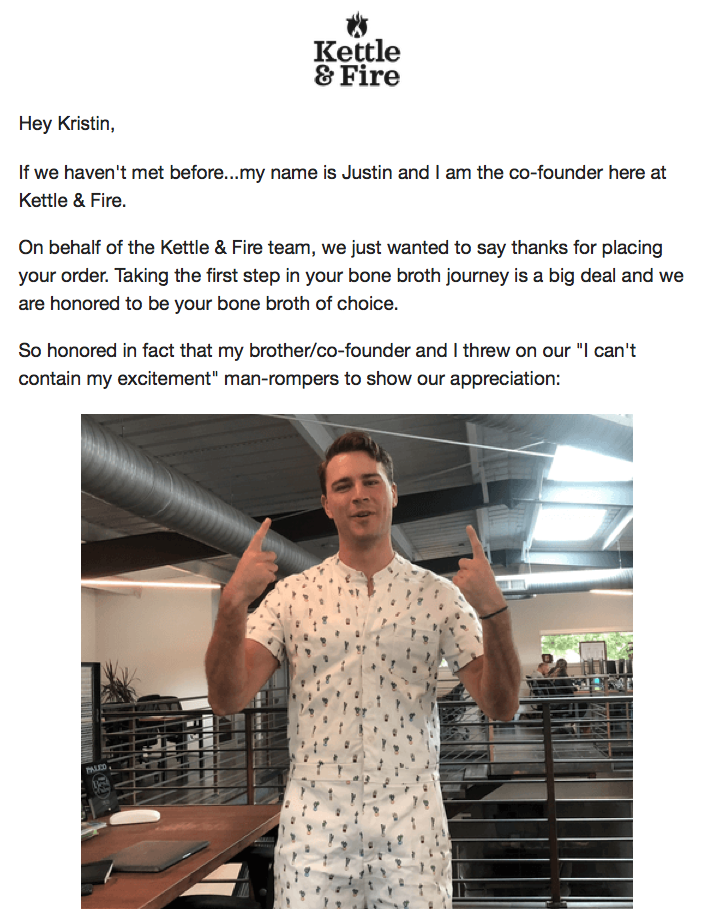
Under the picture above was the caption below, then this picture with its own caption:
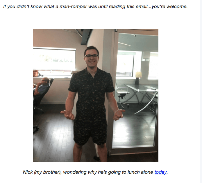
And, continuing on, there is a lot of warmth coming from these romper-clad brothers:
OK, so now you have seen for yourself what a fully optimized engagement site—and a company that endears itself to its customers—looks like. Kettle & Fire sets a very high standard for the rest of us.
Might be time to look at your site and make a list of all the ways you could be engaging your audience as they visit. Truly, the best sites are more like apps than brochures. Which is how you—and your site visitors—benefit most.


