Web design is a variable that changes as fast, if not faster than we can get our latest creation published!
In just the past twelve months, digital adoption has expanded five to ten times faster than was expected, thanks to the pandemic and lockdowns. This, together with the increased economic uncertainty and loss of predictability, has driven customers online in ever greater numbers.
This migration has further shifted the balance of power to the customer, who now has far more control of their relationship with brands. As if this weren’t challenging enough for marketing, customers have also become less loyal and more open to new experiences.
That’s why it’s important for a brand to always be improving their online presence. Not the “rearranging the deckchairs on the Titanic” type of superficial updates, but changes that make the experience better for current and potential customers. What are they? Read on to find out.
What Google wants
What Google wants, Google gets. Since it launched its core web vitals last year, some websites have dramatically increased their search result rankings (Like C3Centricity did!), while others have disappeared off the front page, and the following pages too!
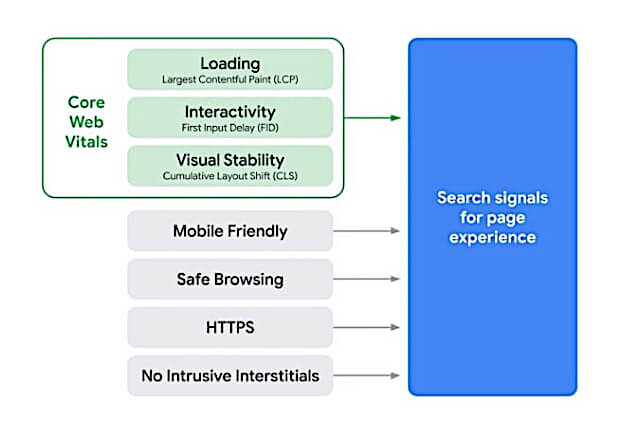
Google announced the introduction of Core Web Vitals last year as a set of metrics related to speed, responsiveness and visual stability, the three most important ones for a good customer experience. These are:
- Largest Contentful Paint: This is the time it takes for a page’s main content to load. An ideal LCP measurement is 2.5 seconds or faster.
- First Input Delay: The time it takes for a page to become interactive. An ideal measurement is less than 100 ms.
- Cumulative Layout Shift: The amount of unexpected layout shift of visual page content. An ideal measurement is less than 0.1.
Google said it would give six months notice before introducing these metrics, to give everyone time to adapt and improve their websites. I haven’t yet seen an announcement but I have seen changes in my rankings (for the better) so I am wondering if they have in fact already been introduced. Do you know if they have?
Taking the perspective of the customer
One of the most frequent reasons why websites fail is because the creator has not taken the perspective of the visitor.
The content has been designed by an organisation with the objective of distributing information that it wants to share with its current and potential customers. Not what they believe their customers might need or desire. And even less the differences between the needs of current and potential customers. Even when the customer is considered, it usually comes as an afterthought, often as a review the day before its launch!
Customer-centric web designs use customer input all along their development, not as a late-stage verification that customers can use it, which is what many companies measure. (if at all!) There are so many opportunities to see how customers are using our websites that there is no excuse for frustrated visitors leaving early, before doing what they came to do.
Quick loading and response
We have all become impatient in life and especially with slow-loading websites. Even when we had the intention of purchasing, a slow experience can have us leaving for another seller’s website.
Speed has in fact become one of the main reasons for visitors to click away from a website, which is why it’s part of Google’s ranking algorithm. The Google recommended page load time is under two seconds!
“Two seconds is the threshold for ecommerce website acceptability. At Google, we aim for under a half-second.”
How many websites do you know that load in under two seconds? Not many from my experience.
According to Blue Corona, only 15% of website load in under 5 seconds, the minimum at 3G according to Google.

How do you increase the loading speed of your web pages? There are plenty of articles you can find that give detailed answers to this question. From my perspective, the easiest actions you can take are to compress all images and to have videos start only when clicked.
Empathy with the customer
There are a lot of discussions today about personalisation and how customers want to be served as individuals and buy unique products made just for them.
This applies just as much to web design. They don’t want to hunt around to find the relevant information for them, they want an intuitive path to exactly what they need when they want it.
There are many things we can do to answer these needs:
- Know your customers and their usual access habits. If most visitors use mobile devices then make the content mobile-friendly.
- Recognise repeat visitors, so they don’t have to complete their personal information again.
- Make the homepage simple with the possibility for visitors to self-select their interest so they get to where they want to get to without too many clicks.
- Personalise content to the needs of the different customer groups you serve.
- If working regionally or globally ensure the content by language is relevant for the geographical area; the sitemap doesn’t have to be identical in every language, but it does have to be relevant.
- Also, when working in multiple languages, the language choice should be clearly displayed at the top of the page. Don’t force your visitors to scroll to the bottom, or even worse, to hunt in the menu to find their preferred language! This is one of my pet peeves, working as I do in a country with four official languages!
In the end, it comes down to knowing your customers (isn’t this always the case?!) and providing the best experience for them.
Ease of use
A good customer-centric website design allows customers to quickly find the information that they need and smoothly guides them along their search or buying journey.
By understanding the various reasons why people come to your website, you can ease their navigation so that they get what they came for within just a few clicks.
However, just like the self-service customer-service phone lines, if you make too many demands (clicks) of your customer, you will have them clicking away.
The functionality of any website needs to be as intuitive as possible. This starts with a carefully planned site structure, with the shortest paths between tasks.
Answering questions
Most people come to websites for information, not really to spend time looking around. That said, answer their question quickly and completely, and they might stay longer to learn more about what you have to offer.
The need for information can be broken down into several specific needs, such as:
- to learn – educate me
- to buy – help me
- to be entertained – thrill me
- to be inspired – surprise and impress me
- to feel connected – reassure me
I suggest you review your own website and ensure that you are answering all these needs in one way or another. From my experience auditing websites as one of my services, inspiration seems to be the one most often lacking.
The Search Engine Journal’s Roger Monti wrote an interesting article on the need states of visitors searching online. You can consult it here: Google: 6 Need States Influence Search Behavior.
A design that fits your brand
Your website is a part of your communication strategy and so should be aligned with the look, feel and tone of your other touchpoints. The colours should be the same and the elements used should support the image you have developed through other media for your brand.
If people don’t “find” your brand when they come to your website, you could have them wondering if they are in the right place. With so many fake sites and URLs, many people are wary of visiting a site for the first time these days.
Also, make sure that their first impression from the above-the-fold look and content are aligned with what they came looking for. With just a few seconds to make that first good impression, make sure that you give your visitors a reason to scroll down your page rather than clicking away.
Every search made online results in millions of possible pages to click, so people tend to very quickly form an opinion as to whether the first answer on Google is useful to them or not.
Examples of great customer-centric web designs
I want to end with a few examples of great websites and provide reasons why they do such a good job of using a customer-centric web design.
Amazon
Amazon is always cited amongst the top companies as an example of the best in customer-centricity. Their website succeeds because it includes a number of the above essential elements.
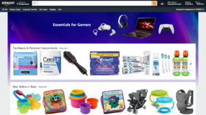 It makes it easy to do business by helping customers quickly find what they want, see the ratings, read the reviews, and make comparisons to competitive products.
Amazon has clearly put itself in its customers’ shoes and provides the most common elements required to make a purchase in prominent positions.
At the time of writing this, it had also recently introduced more product recommendations on the homepage, with personalised suggestions more relevant to each visitor once they sign in.
Apple
Just like its products, Apple’s web design is slick and modern. Visitors can quickly find the information they need and although the look is similar by region, Apple does personalise the experience.
What I find particularly appealing to the Apple web design is the high-quality images used throughout and the detailed but not overwhelming information provided. Again they clearly know their customers very well indeed.
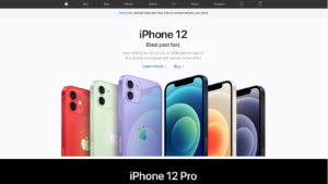 In the screenshot taken in June 2021, you note that they are pushing the latest iPhone 12, but the iPhone 12 Pro is also highlighted above the fold, making visitors tempted to scroll down and learn more. I think this becomes even more impactful than merely showing it as the first product. What do you think?
Innocent
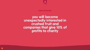 The innocent drinks website is refreshingly (!) bright and colourful, so lifts your mood as soon as it opens. It clearly doesn’t take itself too seriously in line with its brand image and tone.
Its corporate image that opens on the UK homepage is fun and appealing, making you feel good that you drink Innocent – or will become a consumer. And it’s tone is lighthearted with more visuals than usual for its menu and cookies statement.
Scroll down and you get more “good stuff” they’re up to, an easy way to share on social media and even a suggestion book. Altogether friendly, attractive and a good experience.
CNN
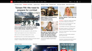 It might surprise you to see a cable network here, but I like their web design for the confidence in who they are, what they offer and most importantly of all, what their visitors are looking for.
Also, when you first click on their app, you hear rather than see the connection. While I agree the sound can become annoying, they are confirming that they aren’t afraid to use their voice.
I also like the choice between catching up on the latest news, watching TV without constant ads, and choosing written or video articles. People know why they go to CNN – for the news – and they make it easier than any other TV channel to do so without too many choices or clicks.
Philips
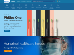 When you go to an electrical goods company, what do you generally want to do? Find information or buy, right? So that’s exactly what Philips shows on their homepage. What I like about their web design is that they manage to provide simple tags so people can find the category that interests them immediately. But they also manage to share some of their corporate PR messaging, in their case, the discount for healthcare workers.
Conclusions
As you can see, ensuring you have a customer-centric website all starts with the customer and your understanding of their needs when they connect with you online.
It is essential that they find what they’re looking for, in an environment that fits with the image and tone they expect from the brand.
A customer-centric website is an essential part of the touchpoints you use to communicate with your customers. You also need to be clear of its purpose in your channel choice; awareness, image building, leads or sales.
Hopefully, the above websites will have inspired you to take another look at how you present your brands online and are great examples of what a customer-centric web design should look like.
If you are interested in reading more about making the actual content itself more customer-centric, I wrote another post on that topic last year. It’s called “From a Good to a Great Website: 9 Ways to Engage More Successfully.”


