
If you administrate an eCommerce site, you’ll be aware that offering a range of quality products is only half the battle. As well as having to provide a good product, online stores must create a seamless user experience if they’re to succeed in converting visitors into customers.
Seamless in this case means without unnecessary hurdles or difficulties. A seamless user experience allows a site visitor to find what they need as quickly and easily as possible, without causing frustration. That is to say, a seamless experience is one in which it is easy to navigate between pages.
Site navigation refers to the functional and visual design of a website, which allows users to move from page to page. It includes things like sitemaps, menus, and the way different pages link together.
These days, even non-eCommerce businesses will list website design and maintenance as one of their core business processes. This article will walk you through the basics of site navigation for eCommerce, helping you ensure a seamless user experience and satisfying customer journey.

Designing for Multichannel eCommerce
In 2021, it isn’t unusual for eCommerce retailers to see over half of their total traffic coming from mobile versions of their site, and so the first thing to think about when designing for a seamless experience is the different devices people might be experiencing your website on.
For mobile browsing, a growing number of retailers are releasing custom apps, which come with greater flexibility in terms of navigation compared to websites designed for viewing in a browser. If you go down this path, remember to implement software testing best practices and to create both iOS and Android versions to reach the greatest number of potential customers.
Homepage and Landing Page(s)
A homepage is a website’s primary page, accessible by typing in the URL without any extra information after the top-level domain. For example, the Customer Think homepage would be customerthink.com, as opposed to one of the more specific pages like customerthink.com/category/customer-experience.
A landing page is the first page a visitor arrives on when they reach a webpage via a link. This could be a link on a search engine results page, for example, but in eCommerce, it will often be a paid advertisement. An attention-grabbing landing page is probably the single most effective way of creating an engaging digital experience for your website’s visitors.
Often, homepage and landing page refer to the same thing, but many websites use customized landing pages depending on where the traffic is coming from. Because your homepage is the easiest form of address to remember, it will always act as a landing page to at least some of your site’s visitors.
Whether they are separate pages or not, the design of home and landing pages is critical for site navigation. It’s from there that all onwards navigation begins. For online retailers, it’s important that the first page people arrive at is no more than two clicks away from a sales page. Usually, this will be one click to reveal a menu and another to select a category.
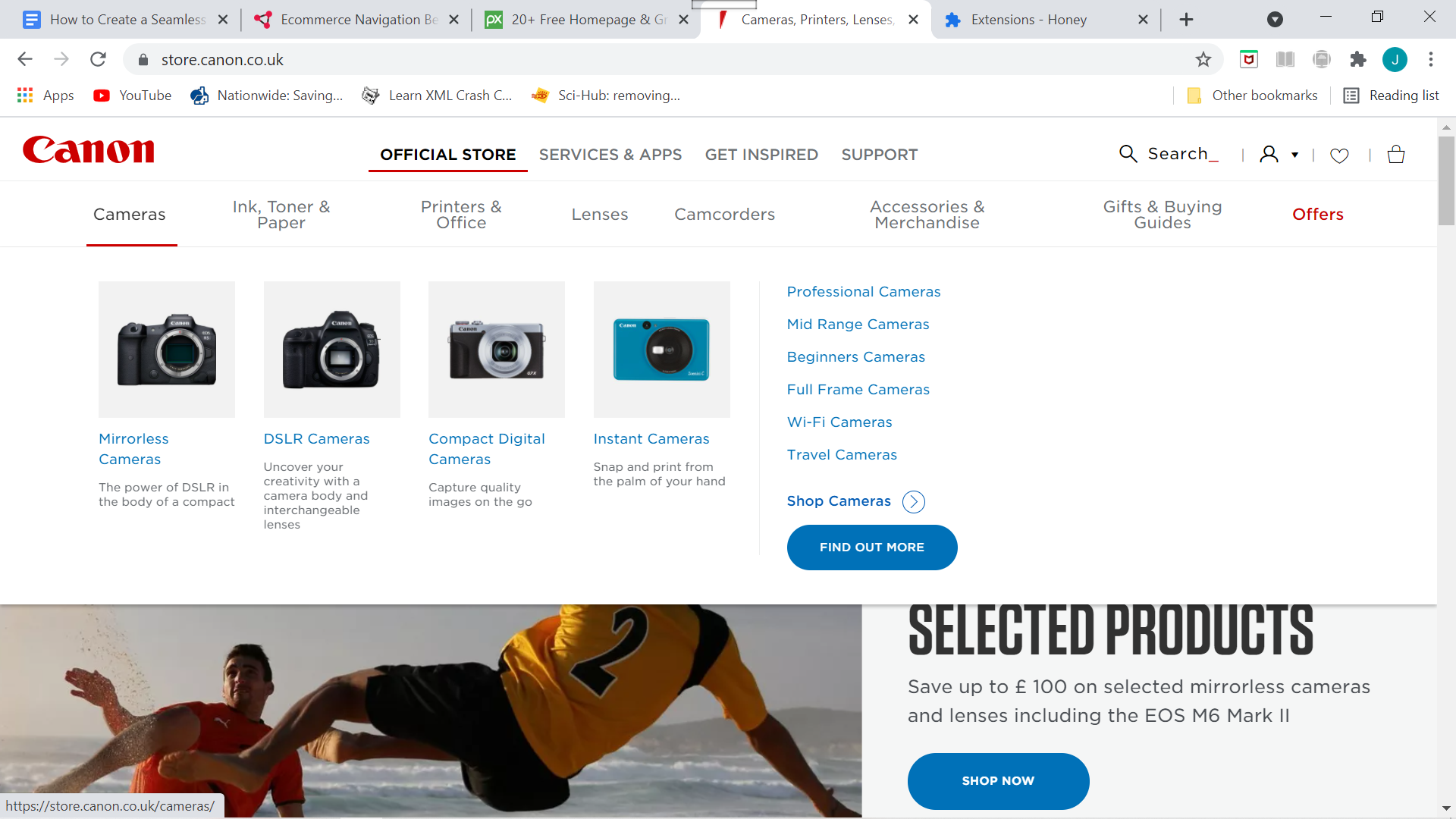
If you have a lot of products, avoid cluttered menus by subcategorizing your inventory, as Canon does with their menu shown above. Just be sure that the main category is also clickable and directs to an overview page with key products displayed.
Testing
A/B testing is the process of showing visitors to your website different versions and comparing their resultant interactions. When making changes to your site’s layout, especially ones that affect the way people navigate through it, testing is essential.
If your eCommerce site has a large number of pages or is the product of more complex web design, it’s worth looking into automation testing. Automation testing is the process of using scripted sequences to automatically test software and other digital products and ensure they meet strict requirements. For websites, it can act as a double-check that things are operating as they’re intended to.
While there have been significant advances in the field of automated QA, there’s no better way to guarantee quality than to review important changes manually. Make sure you are frequently reviewing your typical customer profile/s and experiencing your website from their perspectives.
The Conventions of Website Design
When it comes to web design, conventions are conventions for a reason. Because people have become used to navigating through websites in a particular manner, deviation from these norms can interrupt the smooth experience of a website and lead to user frustration.
While artistic experimentation can make your website stand out from the crowd, there are certain standards that shouldn’t be messed with.
Take icon design. We all know that three horizontal lines stacked on top of each other indicate a menu and that a magnifying glass designates a search feature. If you were to diverge too far from this broadly understood icon language, it would confuse and stand in the way of a seamless user experience.
Another important convention is the location of navigation menus. These should be available at the top or left of your site and should be expandable rather than showing the full menu all the time. This means they are out of the way while visitors are viewing products but always within easy and intuitive reach.
Is Your Information Up to Date?
You might not necessarily think of it as part of site navigation, but for eCommerce, wrong or badly communicated information can seriously inhibit the flow of navigating a website. Think about how websites communicate whether an item is in stock or not. On the one hand, this is a question of inventory management, but it’s also an issue for web design.
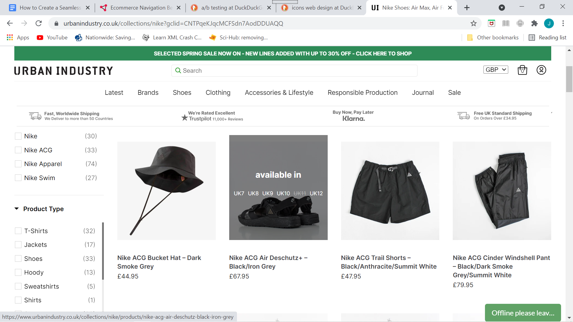
One of the best ways to display stock information is by having it incorporated into your browsing pages. In this model, as demonstrated by Urban Industry below, rather than having to navigate to individual product pages to check availability, simply hovering over a product thumbnail reveals which sizes are in stock.
This makes for an effortless browsing experience uninterrupted by unnecessary clicks and the disappointment of discovering the specific variation you want is unavailable.
When updating your website, however, it’s important to be wary of inadvertently generating bugs. Bugs and glitches are an absolute nightmare for your user experience and are a sure-fire way to put customers off.
Catch bugs before they have a chance to ruin the seamless experience of your website by instigating a comprehensive regression testing regime to ensure that previously developed and tested functions still perform properly after any changes.
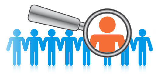
Personalize, Personalize, Personalize
While there are many things you can do to improve the general user-friendliness of your website navigation, the fact of the matter is that different users will value different things.
Create mass appeal by personalizing your website experience to the individual user and implementing the latest data models and customization tools. These include cookie-based approaches, individual customer accounts, and the best RPA tools that integrate task-focused bots into your web design.
If you know a visitor to your website was previously viewing T-shirts, for example, you can adjust the navigation options on their next visit so they’re guided directly to your T-shirts section.
Personalization doesn’t have to require a high level of technical expertise to pull off. Many easy-to-use plug-ins offer personalization features that are straightforward to implement. One simple addition that will create a seamless navigation experience is a search function that remembers previous searches. Not only does this help users to find a product faster, but it might even nudge them towards reconsidering something they’d initially disregarded.
When combined with strong storytelling and creative design, a personalized navigation experience can be just the thing your eCommerce site needs to maximize sales.
The Purchase Process
When considering your website’s navigability, there is one last thing to consider, which is arguably the most important of all – the purchase process.
Purchase order processes are those last stages of the customer journey in which an order is placed and a transaction finalized.
Make navigating to payment easy by having a call to action, such as “pay now”, always on display. This should link to a single page that’s free of distractions, containing only an overview of their basket and a payment details form.
Ideally, you will mobilize one-click pay options such as PayPal or Google Pay to streamline the payment process as much as possible. You should make sure to optimize this final page for autocomplete to make paying as quick and easy as you can.
With a bit of creativity, and by taking into account the design choices available, you should be able to create a seamless user experience for your website by focusing on site navigation. Remember that a website that’s a joy to browse is far more likely to convert traffic into revenue by minimizing your bounce rate and the number of abandoned carts.


