Last week I talked about how to communicate the results of your External Quality Monitoring (EQM) analytics to Executive Management. In talking about, “know your audience” I was reminded of a trip to Greece. Today as we turn our focus to the Operations Team, I recall a much more recent story. In fact, this happened two days ago while I was out shopping.
For an upcoming wedding, I was in search for simple black earrings. It was later in the evening when I entered the department store alone (which I like since there are less crowds, and I can be in and out) in search for my quick purchase. Now, typically in your big brand name department stores, there is NO ONE around to help you other than the required minimum Sales Associates on the floor mainly to man the fort behind the cash register. That night, there was a young lady in the jewelry department who was straightening out the display cases in prep for closing time. She asked if I needed any help. Shocked to hear such a thing from an employee in this particular store, I decided to take her up on the offer. I tell her that I am looking for simple black earrings to go with my dress. Well, 30 minutes later, I was back to where I started…looking for simple black earrings by myself. The sales associate showed me everything from silver sparkling, dangling earrings, to red hoops (“that really pop!”) to huge black flower earrings. All of these I’m sure would look great on girls in her age group, but I was very specific about what I needed for this occasion. She clearly did not listen and did not know her audience.
Reports for the Operations Team
The packaging of the External Quality Monitoring program is an important marketing tool for the contact center and the operational team responsible for its performance. A critical component of the reports is that the research has been executed correctly and the validity of the results is certain. This data inform operational decisions, populates performance management systems and calculates incentives/performance pay. The data are used along with the internal call monitoring data and the operational metrics to provide an accurate assessment of the service function, and to identify directives for each agent and each team.
In addition to providing a snapshot of the service the contact center is providing to customers, operational reports will likely focus on two aspects: location-specific analysis over time and location comparisons. Location-specific data compares the period just past to prior periods and perhaps even to the last year. Such a comparative analysis allows operational management to track changes over time, revealing which interventions yielded the most positive results for a single location.
From a comparison perspective, it is useful for specific locations to be able to rate their performance against their peer locations, as well as the contact center effort as a whole. It can be a source of pride for the successful locations and a spur to more intense efforts for those that lag the whole. Continue to make use of multiple formats for the presentation of results. Remember, some readers are more verbal, visual, or numerical than others.
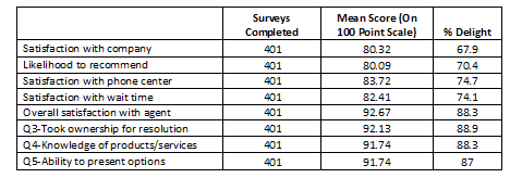
The highest tier of the operations-level report is a summary of all feedback collected for all of the contact center locations and departments. This view of the data provides a status report of the past period’s performance, which can be compared to prior periods. The table below provides aggregate data regarding customer ratings on each question within the survey. The data found in this table presents % Delight (in this example scores of 8 or 9 on the 1-9 response scale used) and mean score, extrapolated to a 100-point scale.
On this scale, the lowest service rating (a rating of 1) is equivalent to zero points on the 100-point scale, and the highest rating (a rating of 9) is equivalent to 100 points with the remaining point distributed across the scale.
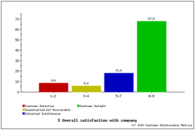
You can classify customer ratings on key questions into loyalty categories to more closely examine the relationship between customer satisfaction and loyalty. Combine key loyalty questions, including customer satisfaction with the company, the representative, and the call itself to create a customer loyalty index (CLI). Customer satisfaction directly relates to long-term customer loyalty that ultimately contributes to shareholder wealth. Trend analysis of CLI is critical to determining if change initiatives are being recognized by customers, reflected in service delivery evaluations, and positively impacting return on investment (ROI).
Four categories are represented in the CLI chart:
- Customer Delight (green in CLI charts). The top two categories on the scale (8 & 9) represent customers that are delighted with your company/service/agents. These customers are key company assets that have been preserved through the service experience. Their high scores provide assurance that they will stay with your company, provided you maintain a consistent level of service.
- Satisfied Indifference (blue in CLI charts). These customers (categories 5-7) represent the primary focus for the next evaluation period. They are generally satisfied, but cannot be counted in the completely loyal category. If presented with an opportunity, these customers may select a different provider. As such, the goal is to move these customers into the delighted category.
- Dissatisfied but Recoverable (yellow in CLI charts). Customers in this category (3 & 4) did not have a positive experience and would likely switch, but you may be able to reach out and change their perception by correcting the service experience. As such, timely and informed follow-up is the key to success with this category of customers. These customers should be the secondary focal group.
- Customer Defection (red in CLI charts). These customers in categories 1 & 2 were very dissatisfied and are most likely to leave your company for an alternative.
The examination of performance means and percentages for key survey questions as describe thus far is important, but contributes only part of the information regarding the callers’ evaluation of service provided by your centers. The survey data was collected to achieve the two purposes. One, how are we doing and, two, what is critical to the quality of the service experience?
- to provide a caller evaluation of the attributes of service, called a performance measure or the mean level of performance, and,
- to enable the analytics to identify the service attributes that statistically impact caller satisfaction, essentially the drivers of caller satisfaction.
The performance means and calculated impact values of each service attribute enable the quantitative identification of areas in which service performance may be below an acceptable level and the resulting impact on satisfaction is high. The process of calculating impact values is a little more intricate than the process of calculating mean performance scores. The regression analysis from the caller satisfaction data computes the impact values and identifies the level of impact each attribute has on overall satisfaction. This allows supervisors and managers to concentrate on the areas that are most important to customers.
The combined aspects of service produce an effect that is perceived by the customer. When determining improvement issues, you should consider how the attributes interact, rather than a static attribute-by-attribute evaluation. Therefore, use a regression model to examine the callers’ overall perception of the service received during the call. An example model, in words, is:
The rating of overall satisfaction with the agent (Q1) is a function of how quickly the agent understood the reason for the call (Q2), how professional the agent was during the call (Q3), the agent’s knowledge of products and services (Q4), the agent providing a clear and complete answer (Q5), the confidence in the information provided by the agent (Q6), and being treated as a valued customer (Q7).
That model, mathematically, is:
Q1 = f (Q2, Q3, Q4, Q5, Q6, Q7)
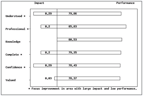
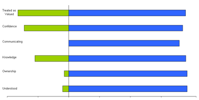
By running the regression analysis, you can determine which attributes impact caller satisfaction the most. Combine these drivers of satisfaction with the measures of performance to present a complete picture, as shown below.
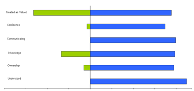
Based on the multivariate regression model, “conveying confidence in the response given,” “taking ownership for resolving the problem/issue,” and “quickly understanding reason for the call” are the most important drivers of satisfaction with the representative for this set of data. The drivers-of-satisfaction results (presented with the impact/performance chart as above) will vary for different sets of data. One team compared to another may have very different strengths and weaknesses. The power of such analysis is that it narrows the scope of focal areas to a manageable number. The example below shows a drivers-of-satisfaction analysis for two teams. These teams differed only in their leadership and membership–average tenure. Customer types served and location were both similar.
Team 1
Impact Performance
Team 2
Impact Performance
Despite the similarities between these two teams, each team generated different performance means and drastically different impact values.
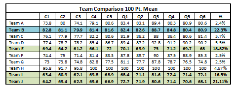
Comparative analysis of different supervisors, teams, locations and departments often reveals service segments that should be emulated and other segments in need of intervention. Based on the table below, only one of the four teams that represent the largest percentage of completed surveys is a top-performing team (based on mean survey scores). An analysis of the strengths, skills and approach taken by members of Team B could aid members of the remaining teams in improving their own performance levels. Conversely, analyzing the lower performing teams could identify the unique challenges they face in servicing customers.
Note: C1-C5 would be general satisfaction criteria; Q1-Q6 would be Agent attributes.
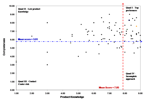
In the example below, we analyzed the characteristics of a low-performing team in order to design corrective training. A drivers-of-satisfaction analysis revealed that “knowledge of the company’s products” and “completeness of responses” were the behaviors that had the greatest impact on the customer’s perception of the call. We plotted individual performance on these two key behaviors to create a visual profile of the team’s makeup. The team’s mean scores (on a 1-9 scale) on these two key behaviors divide the scatter plot below into four quartiles. Each quartile represents a unique agent profile, with a known set of strengths and weaknesses. For example, quadrant III, in the lower left side of the scatter plot, represents the call center’s risk. These agents are below-average performers on both of the key behaviors that have the greatest impact on customer perception of the service experience. While this quadrant represents a comparatively low percentage of this team’s membership, management must conduct an assessment of skill and desire to improve in a timely manner in order to minimize the risk to the contact center and, ultimately, the company’s revenue stream.
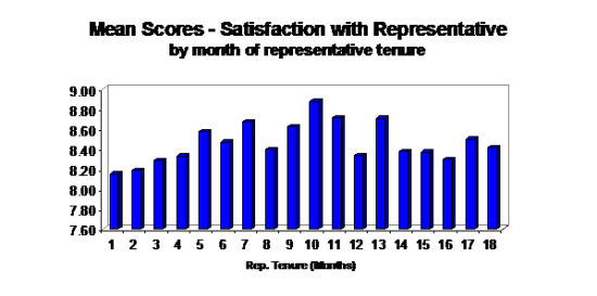
Let’s look at an instance where agent tenure was selected as the differentiating variable among agents. A great deal of time and energy is spent in the contact center industry empowering and developing agents in hopes of ensuring longevity. These actions do not always guarantee that the most tenured agents will be the best performing agents, as was the case in the example below.
The figure above clearly places peak agent performance at approximately 10 months of tenure. Introducing a performance intervention prior to month 10 of an agent’s tenure can extend the peak performance level.
Call resolution plays a key role in driving customer satisfaction. Significant differences in satisfaction scores exist between customers whose calls are brought to resolution and those whose problems/inquiries require follow-up. The table below exemplifies exactly why call resolution is such a key metric.
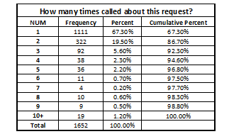
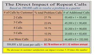
Repeat calls also have a dramatic impact on customer satisfaction. Repeated calls by customers are not only costly from the perspective of agent talk time, but also have a fairly severe impact on customer satisfaction with the company, the call and the agent.
With a representative sample, we can extrapolate the percentage of repeat calls to all calls taken during the month, in order to calculate the operational cost of repeat calls. The average cost per call is multiplied by the number of repeat calls (as determined by percentages below) for the second, third, etc., calls required. Keep in mind that the indirect cost is also a factor as it is associated with the significantly decreased satisfaction as shown in the section above.
An analysis of company-level data in this manner provides members of the operational team with a solid understanding of current customer satisfaction levels, the drivers of customer satisfaction and areas in need of improvement. However, examining the data longitudinally reveals performance trends and the impact of interventions.
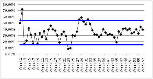
The figure below is a control chart for call resolution. Control charts are often used in Six Sigma to differentiate between normal and abnormal process variation. Each point in the control chart below represents weekly performance on the key metric call resolution. The blue horizontal lines represent the upper (UCL) and (LCL) lower control limits for this metric, based on mean performance and standard deviation of weekly performance around this mean. Any point that resides either below the LCL or above the UCL indicates that the call resolution process is out of control, requiring an intervention.
Performance above the UCL indicates that agents are resolving an abnormally high percentage of calls. On the surface this may seem desirable, but further analysis reveals that resolution was gained at the expense of customer satisfaction. Performance below the LCL could have severe implications on customer satisfaction and contact center costs.
Next in the series, we turn our focus towards the Supervisors and Agents.
 This post is part of the book, “Survey Pain Relief.” Why do some survey programs thrive while others die? And how do we improve the chances of success? In “Survey Pain Relief,” renowned research scientists Dr. Jodie Monger and Dr. Debra Perkins, tackle numerous plaguing questions. Inside, the doctors reveal the science and art of customer surveying and explain proven methods for creating successful customer satisfaction research programs.
“Survey Pain Relief” was written to remedy the $billions spent each year on survey programs that can be best described as survey malpractice. These programs are all too often accepted as valid by the unskilled and unknowing. Inside is your chance to gain knowledge and not be a victim of being lead by the blind. For more information http://www.surveypainrelief.com/

