Best Buy unveiled a new store format last week at its flagship location a few blocks from their corporate headquarters. I visited the store twice last week. You can find more general review at The Mama Report, including photos, as well as at the Star-Tribune. The store has opened to rave reviews, and understandably so. The new format is beautiful, and greatly increases the opportunity to play with and learn technology.
The company traditionally introduces new store concepts in 1-3 stores, evaluates them, and determines which parts (if any) to scale. There are too many changes to include in one post, including such additions as a “Solutions Central” to ask questions, educational “digital displays” teaching about products, and vignettes that allow you to see how appliances might fit into your home. I will focus on the overall look and feel, and three specific areas: Tablet Central, the 3DTV Experience, and the Magnolia Design Center. This post reviews the format, and gives advice as to which parts should be scaled.
Full Disclosure
I worked for Best Buy for six years through 2008, and still love the brand. My last three years I designed interactive experiences such as those featured in this store. Several are clearly descendants of projects I led. This makes me more familiar with the issues than most.
We faced two huge challenges in designing these experiences. The first is that the nature of the work is that we used consumer-grade equipment to create commercial-grade experiences. Your typical TV or tablet is not designed to run 14 hours a day with kids banging on them and teenagers deliberately trying to sabotage them. Yet this is what we were up against.
The second issue is highly related. Setting up and maintaining these experiences cannot be done by typical merchandisers. Instead, they require skilled technicians at higher pay grades. Unfortunately, labor challenges (such as I discussed here) meant that Best Buy has historically not invested in the level of support needed to maintain these experiences.
This combination of factors meant that at any given time from 20-65% of all stores had experiences that were not functioning. This led the company to pull back on interactive experiences around the time I left. I hoped that Best Buy had learned to design experiences in such a way as to avoid these issues. Unfortunately, this does not appear to be the case.
Overall Store Design: Much Improved
Even though the remodeled store was about 25% smaller, the new layout, shorter shelves and bright paint made it look bigger. This is a place I want to come visit and play. Multiple staff offered to help me as I moved around, something that has not always been true. The associates appeared to be very engaged!
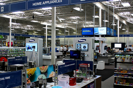 Photo courtesy of The Mama Report (www.theMamaReport.com)

Unfortunately, my initial experience served as a metaphor for my two store visits. I typically start a store visit in the restrooms. You can learn a lot from examining the level of attention there. These were nice and clean, even featuring fake flowers in the corner. But when the hot water was turned on, nothing came out. Nice look, poor functionality. This became a theme.
I have been thrown out of a store before for taking pictures, so I’m afraid you will have to use your imagination for some of this. I also limited my interaction with staff, as I did not want to distract them from customers, and there were many visiting on both days.
There were three primary areas I was interested in based on the promotions leading up to the opening: Tablet Central, the Home Theater 3DTV Interactives, and the new Magnolia Design Center.
Tablet Central: Nice Layout, but Not Quite There
This is one of the first areas you experience as you enter the store. This photo shows the overall layout, with each vendor’s tablets featured in their own section.
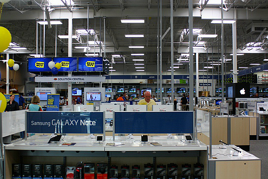 Photo courtesy of The Mama Report (www.TheMamaReport.com)
The nice clean look makes it easy to find the product. You pass through all the other vendors’ tablets before reaching Apple (you can see it back and to the right), which is a smart decision. Each tablet is on a post so you can interact with it.
I expected to see an educational interactive to help me decide which tablet is right for me. It’s possible that one exists, but I didn’t see it on either of my visits. In 2008 I designed an educational interactive for GPS devices, and I hoped they used something similar for tablets. But no luck.
The beautiful design was hampered by two execution issues – one predictable, one incomprehensible. Each tablet features an interactive that shows its features. But two were not functioning, including one tablet that was frozen at both of my visits. Some of these tablets (especially the less-expensive ones) were not designed to run third-party interactive demos, so it was not surprising.
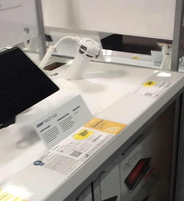
The second issue was worse: When I visited on Monday, there were 37 spots for tablets, but 9 were empty! When I returned on Thursday, there were now 11 empty spots – 3 out of 6 on the first section you see as you enter the department. You can see what the empty post looks like here – not the ugliest thing, but hardly what you want to see in a new store opening.
The store was only open for two days, so why the empty posts? Did they sell out of some items? A beautiful design is wasted with an empty post in the middle. Three in one section is incomprehensible.
If this issue shows itself within the first week in the first store, then it will definitely be repeated as this concept expands. It’s not the biggest issue – but would you ever see this at Target?
Home Theater 3DTV Interactives: Much More Work Needed
These have been a part of Best Buy stores for years. Interactives let you learn more about how the products and technologies work. In the back of this home theater department is an impressive-looking 3DTV display with separate pods for LG, Sony, Panasonic and Samsung 3D televisions.
This was my first exposure to 3DTV, but the display did not whet my appetite as Best Buy obviously hoped it would. The quality of the content was inconsistent, from beautiful to poor. In one, a jumping person had a leg that looked strangely pixelated; the Panasonic display’s text looked horrible. I found the 3D more of a distraction than attraction.
The displays were certainly engaging and easy to use. Each has a set of glasses that you can easily adjust to your height to view the 3D. There are also additional glasses for others to wear.
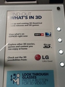
Four buttons allow you to choose between different types of content: general 3D content, ESPN-3D, Blu-Ray movie trailers, and content specific to this vendor. But this features a puzzling design, as you can see below.
At first, it looks like there are three options but four buttons. Can you tell me which button is for ESPN3D? Why don’t the buttons line up with the text? I pushed the wrong button a few times before I understood the layout. This suggests that the designers did not see the buttons and the sign together before they came to the store. Five minutes of concept testing would catch this issue, making it easier to use.
The displays also had significant functionality issues. The ESPN-3D button resulted not in the promised content, but instead in a bouncing DirecTV logo. This was true both days I visited.
On Monday, the Sony and LG stations showed a beautiful trailer for Hugo, but neither Panasonic nor Samsung worked. The Panasonic display refused to display 3D. And the Samsung glasses did not work – you saw double images whether watching with or without the glasses. When I returned on Thursday, the Sony TV now had a big blue message on-screen referring to a software update that had recently completed, rendering it non-functional. But at least the Panasonic display was now fixed (Samsung was still broken, and the LG was functional both times).
I talked to a rep about the issue on Monday, and he was quite familiar with the problems. I understand that things break, but these issues were obvious to casual observers. If this happens in the store right next to the corporate office, how will things be in Bangor?
Magnolia Design Center
The third item is clearly the most impressive. Magnolia is a high-end home theater retailer Best Buy purchased 8-10 years ago, and several hundred of their stores now include a Magnolia store-within-a-store featuring higher-end home theater products. This design center included products above even the typical Magnolia line.
The Design Center hosted three rooms that I can only dream about: an outdoor kitchen with TV and automated shades, an outdoor theater, and the ultimate home theater room. The house is run by Control4 home automation systems that allow you to manage all the devices with an iPad, even raising and lowering the shades and lighting. The home theater room features an incredible 7.2 sound system with gorgeous video, home automation servers, high-end soundproofing, and a screen that drops from the ceiling – everything you can imagine.
Most of it was functional, although they did have to rely on the original remotes more than once, and a few features never did work. In this segment, perfect execution is even more important. If customers are spending this kind of money on a home theater setup, it had better work flawlessly every time.
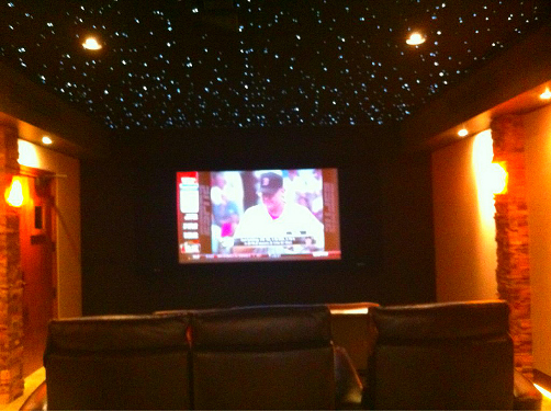 Photo courtesy of The Mama Report (www.theMamaReport.com)
I walked away very impressed, but with one troubling question: Who is this Design Center for? The home theater room alone must have had over $200,000 in equipment. While there are people who buy this equipment, do they shop at Best Buy? And are there enough of them to pay for this use of space? I understand the concept of showing higher-end equipment to move people up the price curve. But how will a shopper with a budget of $10,000 react to a $200,000 demo?
I can only hope that the company has strong research to show that there is a very wealthy segment willing to shop at Best Buy. But my suspicion is that this room’s primary purpose will be to wow vendors (and employees’ friends) rather than to drive purchases. Which is fine, so long as the staff understands when it is appropriate to use this room for customers (very rarely!).
The Design Center is reportedly going to two other Twin Cities stores (Oakdale and Minnetonka). These are in wealthier suburbs, where they might find a more receptive audience.
What Items Should Scale?
Best Buy is a smart company, and typically uses a 1-3 store test to shake out the concept and determine what should scale. Given this approach, which items should scale?
The overall design is very impressive. The company does not plan to open many more stores, but this design should certainly be used for relocations and any planned remodels. Best Buy has an impressive analytics capability, and will certainly monitor the store to find out the lift in revenue. I imagine it will be significant.
Tablet Central should also scale, but only after some thought is given to the merchandising approach (a version of Tablet Central has already scaled). Several obvious options exist: use less space to avoid the gaps or creating a design that does not require empty posts for missing merchandise. Or, even better, find a way to have sufficient inventory for each space. There are multiple ways to fix this issue, but it should definitely be fixed before scaling.
The 3DTV display needs to be put on hold until it can be rethought. This is a destination, and any content needs to wow customers. The trailers definitely do, but some of the vendor content does not. More importantly, more thought needs to be given on it maintenance, either using a simpler experience or investing in more in-store labor to support it.
The Magnolia Design Center is difficult to evaluate without access to their research. But I would move very slowly on this. The functionality issues are not unusual for a new display of this type, and they are minor enough that I am sure Best Buy can fix them. But I am still uncertain whether this will drive sufficient revenue.
Is the Issue Design or Store Execution?
True design takes the store’s capabilities into effect. But Best Buy has always been more about moving quickly than it has about perfect execution. My suspicion is that the swirl regarding the company’s leadership led them to rush this store design before it could be fully tested. They typically roll these new designs out quietly, away from the flagship store and without significant promotion.
Now that it is out there, the company needs to focus on the strengths – the beautiful design and increased interactivity – and scale those quickly. I’m a huge fan, and I know that this will help to restore their reputation. But Best Buy also needs to have the patience to hold back those items that are not ready to scale, particularly the 3DTV display and perhaps the Magnolia Design Center. Here’s hoping they take the time to get it right.

