

Any damn fool can make something complex; it takes a genius to make something simple.
—Pete Seeger
As a happy byproduct of the global pandemic my wife and I now see each other during the normal workweek. As such, we started a rather mundane tradition of watching one show in the evening together: the Nightly News. It was our porthole to the wider world, and we were frequently joined by our children. We often had discussions of events as they appeared on television making it a quasi “teachable moment” family experience.
You will notice my use of the past tense as our streaming service and ‘smart TV’ have ceased to cooperate with one another making my five thousand dollar ultra-high flat screen TV a curious black picture frame in the middle of the living room.
There was a time when you could simply turn on the television and watch. Not so anymore, I now have opted to choose from a variety of streaming sources pumped via fiber optic cable via the air to my inert television. It is glorious when it works, but maddening when it doesn’t.
In the race to offer more options and content, streaming providers and hardware providers have in some ways made things more difficult to enjoy the simple things, like the Nightly News. Assuming the Wi-Fi didn’t drop, I now have to navigate through a home page, to the streaming service, find “my stuff”, and then find the right episode. Once I was regarded as a technological wizard having programmed in esoteric languages such as Pascal and C+. Now my children roll their eyes at their doddering old father as I surrender the remote to them so they can assist me. It’s kind of sad.
To my defense I don’t think I am alone. Perhaps you are one? Notwithstanding, my technical incompetence, I think there is something to be said of the designer itself. Some designers feel that more choices are always better. Some believe that “new’ is always better. Not so.
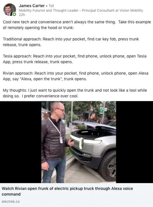
Take for instance my partner James Carter of Vision Mobility reviewing the latest innovation from startup Truck manufacturer Rivian
What could be previously accomplished by the click of a button now has several added steps. Is this really progress for the end-user? I think not, but it has the illusion of being somehow cool.
We see this everywhere in our day-to-day lives. Whether it is your television, your car, your banking account, or your grocery store this creeping complexity is continually trying to coil around your life to make things “easier”.
Now, don’t count me as a Luddite, there are many technologies I find absolutely game-changing. Knowing where my children are without having to call them, being able to work from home due to teleconferencing advances, and viewing the status of my pizza delivery are all amazing advances thought to only be in a world of Science Fiction a few years ago.
So how do we keep technology helpful rather than burdensome? Having been involved in the design, testing, and development of software over the years I have found some good rules of thumb in design. Some of these you might be familiar with, some you might not, but here we go.
1) Keep it Simple
This first is rule simple: simpler is always preferable to better. Steve Jobs’ rule of thumb was to strip everything away but what was absolutely necessary. I think this single-minded pragmatism is probably the best advice for any design. It is the design version of Occam’s Razor where the simplest explanation is always preferred over more complex ones. Something that takes three steps is preferable to those that take four. Two steps or even one is much better.
The sign of truly great design is that it does not require an owner’s manual whatsoever; the design is so intuitive as to be self-explanatory. Take, for example, the iPad which has touch screen technology that is so intuitive that digital natives instantly understand how to navigate it and expect all screens to operate similarly.
How to achieve simplicity? One approach is to observe the number of steps it takes to do important tasks. Can you reduce the steps? Are there steps that are adding little or no value? My favorite example is the needless “download” button in a popular learning management system. If I want to download my grade sheet The first screen looks like this…
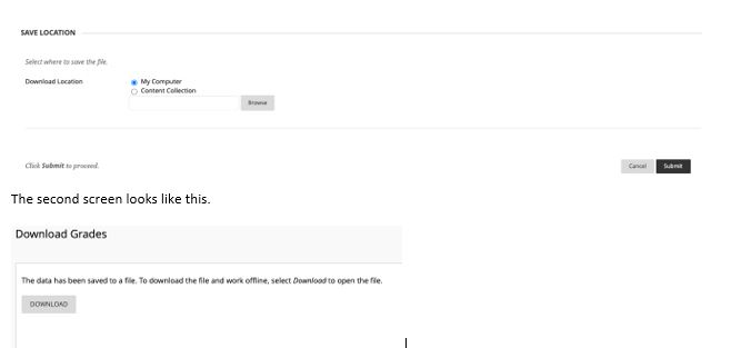
Is the second screen necessary? I already told the application that I want to download a file, why is it asking me again? It’s little nuisance like this that over time frustrates end-users who perform these tasks over and over again. You can find these wasted steps through formalized user testing or just going out and using your tools yourself. This brings me to my second rule of thumb…
2) Eat Your Own Dogfood
Years ago, I worked for an auto manufacturer. While an excellent company and a fantastic job it was interesting to note the cloistered automotive life of many of its employees. Most employees got a new car every year that they ordered from their office chairs. In a few weeks, it arrived at HQ, and you walked down to vehicle services and grabbed the keys. That was it. Payment was deducted automatically from your salary and insurance was included. It was serviced for free on campus and if you ever got it in an accident it was handled as well. The next year you turned in your old vehicle and picked up your new vehicle and repeated the almost frictionless cycle of vehicle ownership.
When reports of suboptimal dealer experiences would surface some executives were either incredulous or in outright disbelief. After all, their entire ownership experience was devoid of any dealership interaction whatsoever. They had no way to relate, let alone empathize with customers complaining about a dealer experience. Now, I don’t want to paint with too broad a brush as there were many who were intimately involved in the dealership experience, but the point being is if you don’t walk in your customers’ shoes you are going to have a hard time understanding their challenges. Perhaps executives having the same dealership experience as their customers might open some eyes.
Resist the easy path and use your own products. Use your company’s services. Experience them firsthand. I have done thousands of interviews, focus groups, and surveys, and not one of them can substitute for firsthand experiences.
3) Use UX Jujitsu
The tracks of human behavior cut very deep behavior ruts that are hard to change. While some technologies are so good that it is worth nudging behavioral change, in other instances it is simply not worth it, for good reason.
Sometimes a seemingly ‘better’ design is not necessarily deemed better by end-users. For example, many years ago I was in the business of designing report portals for busy franchise operators. Until recently, most reports were paper, and we were on a quest to reduce cost and make things ‘easier for end-users. The idea is that these managers could just view the screen rather than print out reports. To that end, we created online reports and waited. They were awesome and you could filter and manipulate data in ways that you could not with the old static paper reports. Shortly after launch, we started hearing that the new reporting was not being used as much and complained that it didn’t print out very well.
My programmers grumbled that they weren’t supposed to be printed, but they relented and started making them more print-friendly. Interested, I went out and observed how these reports were being used. It turns out that in many cases results were reviewed in the morning in the form of an ‘all hands’ meeting. These were pre-tablet days, so lugging a PC for everyone to view was not practical. Instead, the manager printed out reports and handed out verbal praise for jobs well done while employees gathered round in a semi-circle. As designers, we missed understanding the context of usage and violated ingrained institutions and rituals.
In retrospect we should have figured out the use case for these reports rather than arrogantly deciding our approach was “better” or “easier”. It was a great lesson in going out and understanding the context of use to inform design. Use existing behaviors to your advantage rather than fight against them with ‘better’ solutions.
4) Avoid Feature Creep
Feature creep plagues systems that have been in place for a long time. In fact, if you are at a PC or Mac right now you probably have several forms of software that suffer from feature creep. Like cities, over time software evolves and grows. New features are added to increase value and keep up with the Jones. Unfortunately, it is rare for features to be deleted lest it offends some long-time users. This results in a glut of features, some of which are rarely used and add to the clutter and usability of the tool.
Feature pruning is oftentimes a tough but necessary process to keep software easy to use. It is important to do your homework and figure out which features are critical and which ones are not. If you have a feature used 1% of the time then either it is not something people want, or it is not something of which users are aware. Sometimes it may even be practical to spawn separate tools if you get too far off course of the prime usage.
5) Understand your Ecosystem
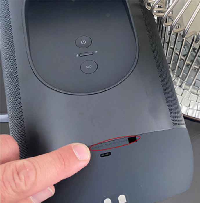
Software user experience doesn’t exist in a vacuum, it is part of a more holistic experience. For example, I recently purchased a new Sonos system and the setup was absolutely stellar. Very easy and intuitive…until I had to register the speaker by referencing the serial number in 2 point font black on black on the rear of the device. While I am no spring chicken, this task would test the vision of Superman.
The point is they had an excellent UX ruined by a design decision on the hardware, which seems pretty easy to fix. Companies that do good experiential integration well have a distinct advantage over their competitors. For example, the allure of Tesla vehicle is not just in the electrical vehicle itself. Tesla has heavily invested in a (to date) exclusive, reliable, massive re-charging infrastructure that makes re-charging on the road simple and easy. They have built a truly integrated app that is as much a part of the ownership experience as the vehicle itself.
To avoid UX myopia it is important to understand the user experience in the context of the overall experience. This can be accomplished through end-to-end journey mapping with customers (not just internal conversations about how you think it works). Secondly, organization structure also strongly influences design. When you have multiple siloed departments not communicating this is bound to happen. Having an organizational structure that allows for easy cross-communication and collaboration is paramount in designing holistic experiences.
6) Make Sure it Works
It should not be necessary to make this point, but it is important. It is startling the number of poorly designed and unreliable products that are on the market. This issue is especially pronounced in the “we-will-get-in-the-update” world of agile software design. While minimal viable products are a necessary and great way to get a product out for testing fast, it needs to perform its primary function well. If you have a weather app it better reliably tell the weather. It’s ok if some navigation is awkward or the data visualization isn’t perfect, but it better deliver the core value reliably. If any product is not reliable, people will quickly abandon it.
For example, my television. It’s really great I can browse the web, listen to Spotify, and have it integrated with my wireless sound system, but if I cannot watch Lester Holt tell me about the state of affairs in the world I am not happy.
Again, if you are using your own products and regularly checking in with customers you will know if your product is reliable or not. While last in the list this is by far, the most important facet of design.
Coda: The Nightly News
I think you will be relieved to learn that last night I finally figured out why the television was not working. After some investigation, there was a host of app updates that did not automatically kick-off. It took a few hours of research to figure out, but after navigating five levels down I found the update applications screen and had it fixed in 60 seconds. Again, just highlighting while complexity is tempting, simplicity is always preferred by end-users.


