
Business leaders understand how their business is performing by monitoring different metrics. Metrics are essentially a summary all the data (yes, even Big Data) into a score. Metrics include new customer growth rate, number of sales and employee satisfaction, to name a few. Your hope is that these scores tell you something useful.
There are a few ways to calculate a metric. Using the examples above, we see that we can use percentages, a simple count and descriptive statistics (e.g., mean) to calculate a metric. In the world of customer feedback, there are a few ways to calculate metrics from structured data. Take, for example, a company that has 10,000 responses to a recent customer survey in which they used a 0-10 point rating scale (e.g., 0 = extremely dissatisfied; 10 = extremely satisfied). They have a few options for calculating a summary metric:
- Mean Score: This is the arithmetic average of the set of responses. The mean is calculated by summing all responses and dividing by the number of responses. Possible mean scores can range from 0 to 10.
- Top Box Score: The top box score represents the percentage of respondents who gave the best responses (either a 9 and 10 on a 0-10 scale). Possible percentage scores can range from 0 to 100.
- Bottom Box Score: The bottom box score represents the percentage of respondents who gave the worst responses (0 through 6 on a 0-10 scale). Possible percentage scores can range from 0 to 100.
- Net Score: The net score represents the difference between the Top Box Score and the Bottom Box Score. Net scores can range from -100 to 100. While the net score was made popular by the Net Promoter Score camp, others have used a net score to calculate a metric (please see Net Value Score.) While the details might be different, net scores take the same general approach in their calculations (percent of good responses – percent of bad responses). For the remainder, I will focus on the Net Promoter Score methodology.
Different Summary Metrics Tell You the Same Thing

Table 1. Correlations among different summary metrics of the same question (likelihood to recommend).
When I compared these summary metrics to each other, I found that they tell you pretty much the same thing about the data set. Across 48 different companies, these four common summary metrics are highly correlated with each other (See Table 1). Companies who receive high mean scores also receive a high NPS and top box scores. Likewise, companies who receive low mean scores will get low NPS and top box scores.
If each of these metrics are mathematically equivalent, does it matter which one we use?
How Are Metrics Interpreted by Users?
Even though different summary metrics are essentially the same, some metrics might be more beneficial to users due to their ease of interpretation. Are there differences between Mean Scores and Net Promoter Scores at helping users understand the data? Even though a mean of 7.0 is comparable to an NPS of 0.0, are there advantages of using one over the other?
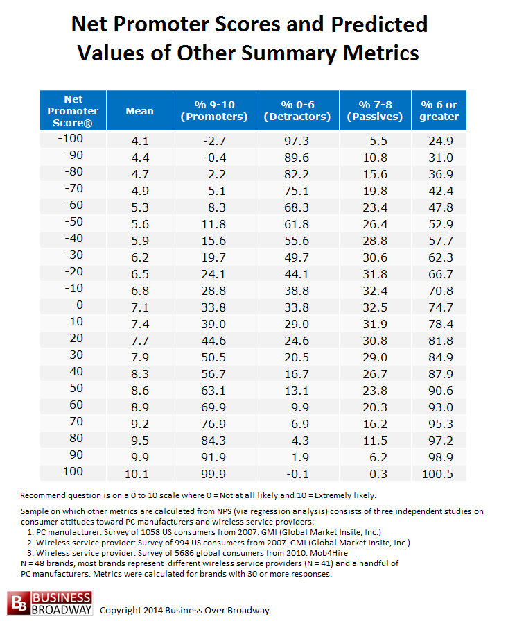
Table 2. Net Promoter Scores and Predicted Values of Other Summary Metrics. Click image to enlarge.
One way of answering that question is to determine how well customer experience (CX) professionals can describe the underlying distribution of ratings on which the Mean Score or Net Promoter Score is calculated.
Study
Study participants were invited to the study via a blog post about the study; the post included a hyperlink to the Web-based data collection instrument. The post was shared through social media connections, professional online communities and the author’s email list.
For the current study, each CX professional ran through a series of exercises in which they estimated the size of different customer segments based on their knowledge of either a Mean Score or the Net Promoter Score. To ensure Mean Scores and Net Promoter Scores were comparable to each other, I created the study protocol using the data from the study above. Table 2 includes a list of six summary metrics with their corresponding values. NPS values range from -100 to 100 in increments of 10. The values of other metrics are based on the regression formulas that predicted a specific summary metric from different values of the NPS. An NPS of 0.0 corresponds to a Mean Score of 7.1.
First, each study participant was given five NPS values (-100, -50, 0, 50 and 100). For each NPS value, they were asked to provide their best guess of the size of four specific customer segments from which that NPS was calculated: 1) percent of respondents with ratings of 6 or greater (Satisfied); 2) percent of respondents who have ratings of 9 or 10 (Promoters); 3) percent of respondents with ratings between 0 and 6, inclusive (Detractors) and 4) percent of respondents with ratings of 7 or 8 (Passives).
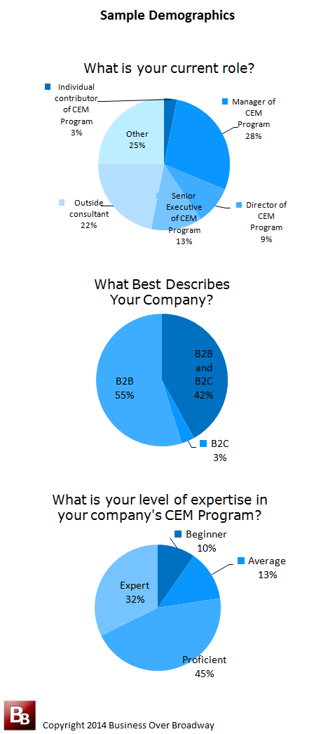
Table 3. Sample Demographics
Next, these same CX professionals were given five comparable (to the NPS values above) mean values (4.0, 5.5, 7.0, 8.5 and 10.0). For each mean score, they were asked to provide their best guess of the percent of respondents in each of the same categories above (i.e., Satisfied, Promoters, Detractors and Passives).
Results
A total of 41 CX professionals participated in the study. Most CX professionals were from B2B companies (55%) or B2B/B2C companies (42%). Three quarters of them had formal CX roles, and most (77%) considered themselves either proficient or experts in their company’s CX program. See Table 3.
Figures 1 through 4 contain the results. Each figure contains three pieces of information that illustrate the accuracy of CX professionals’ estimate. The red dots represent the actual size of the specific customer segment for each value of the NPS. The green bars represent the CX professionals’ estimates of the size of the customer segment as well as their corresponding 95% confidence interval)
Figure 1 focuses on the estimation of the number of Promoters. Results show that CX professionals underestimate the Top Box percentage (i.e., Promoters) when the Mean Score is high. For example, CX professionals estimated that a Mean Score of 8.5 was equivalent to 45% Top Box Score when the actual Top Box Score would really be 64%. We saw a smaller effect using the NPS. In general, CX professionals could more accurately guess the Top Box Scores when using Net Promoter Scores, except for the highest NPS value of 100 (Actual Top Box Score = 100; CX professional’s estimate = 89).

Figure 1. Estimating % of Promoters from NPS and Mean Values – Click image to enlarge.
In Figure 2, I looked at how well study participants could guess the size of the Bottom Box Scores (i.e., Detractors). Results show that CX professionals could accurately predict the percent of Detractors throughout the range of NPS values. On the other hand, CX professionals greatly underestimated the Bottom Box Scores when the Mean Score was extremely low (Mean = 4.0; Corresponding Bottom Box Score = 89; CX professionals’ estimate of Bottom Box Score= 64).
In Figure 3, I looked at how well study participants could guess the size of the Passives segment. Again, CX professionals were able to accurately estimate the percent of Passives across all values of the NPS. When using Mean Scores, however, study participants tended to overestimate the size of the Passives segment across all levels of the Mean Score.
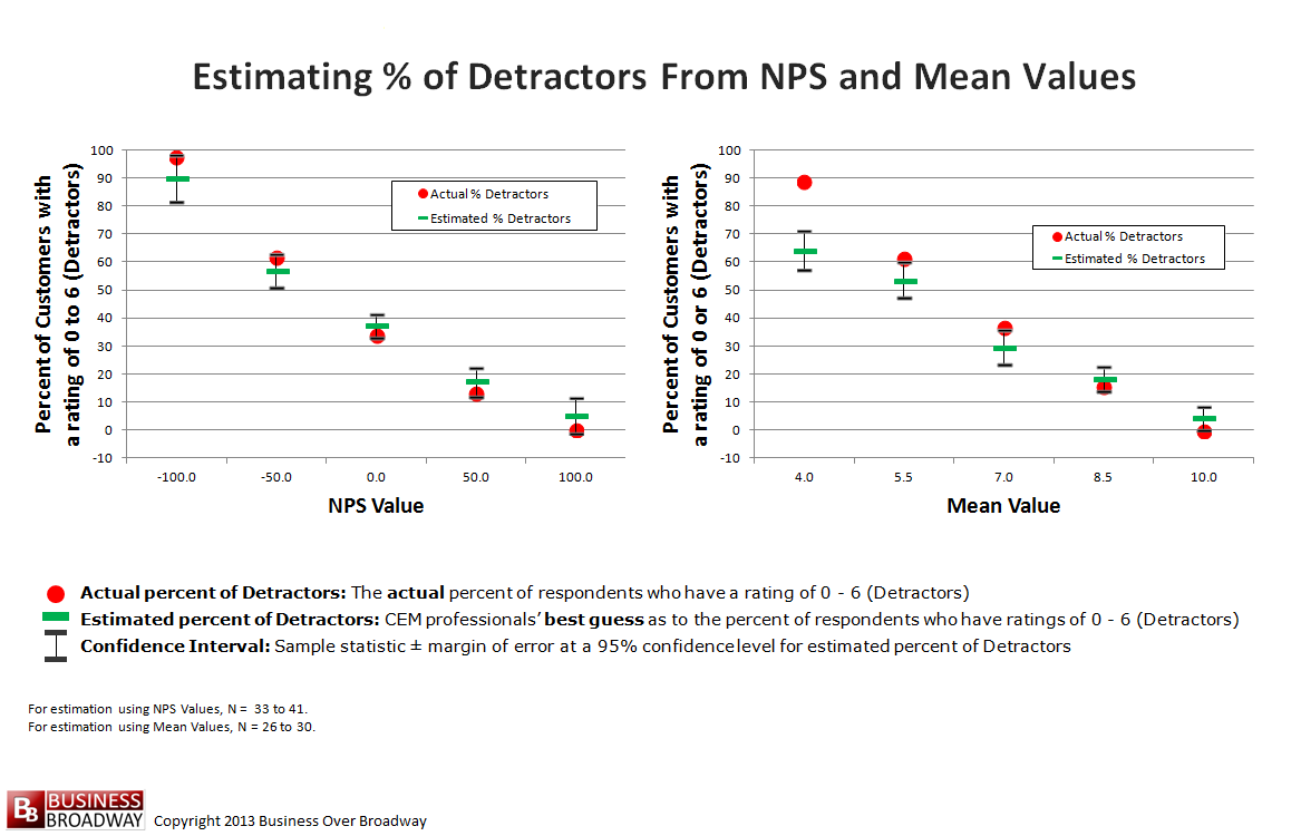
Figure 2. Estimating % of Detractors from NPS and Mean Values – Click image to enlarge.
In Figure 4, I looked at how well CX professionals could estimate the size of the Satisfied segment (rating of 6 or greater). Unlike the other findings using the NPS, we see that study partcipants underestimated the size of this segment across all levels of the NPS. The effect was less pronounced and slightly different when CX professionals relied on the Mean Score. Under this condition, CX professionals underestimated the size of the Satisfied segment when Mean ratings were 5.5 or above but overestimated the size of the Satisfied segments when Mean ratings was 4.0.
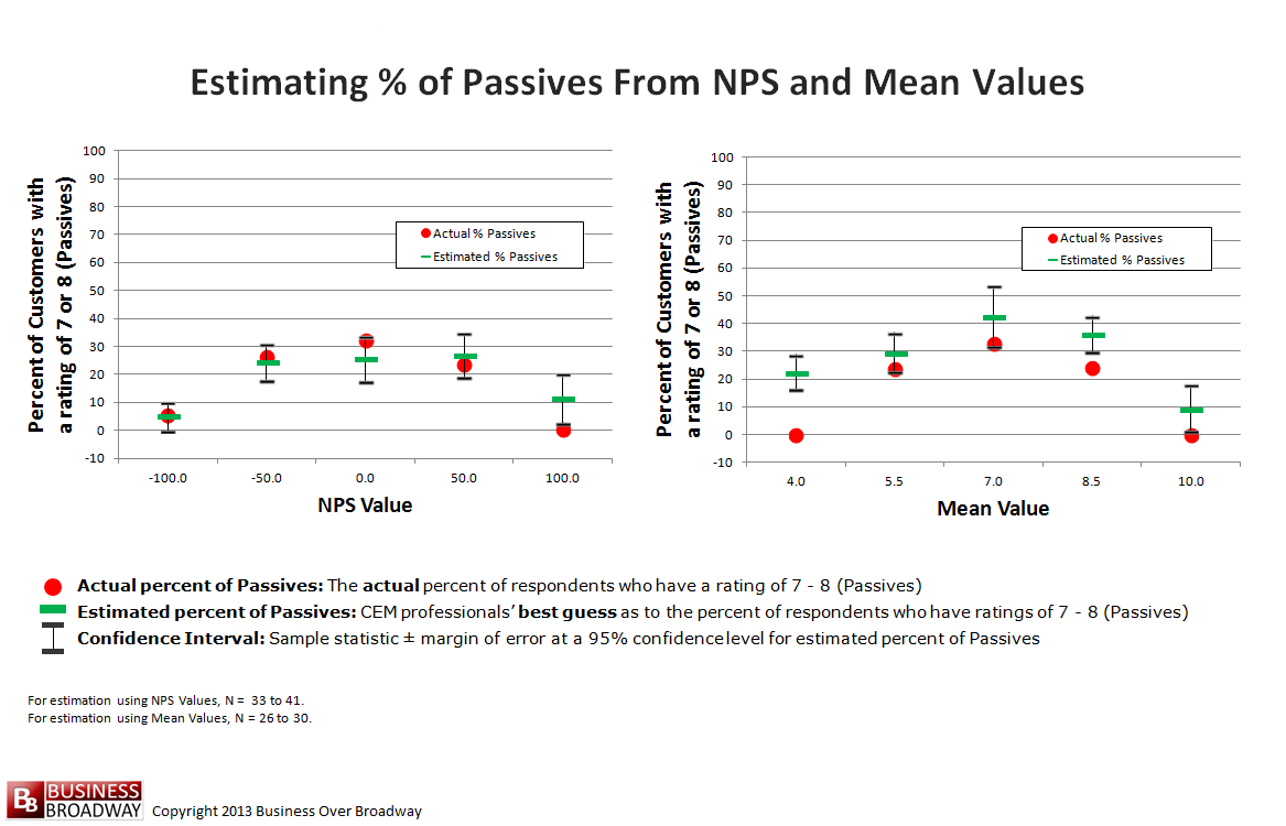
Figure 3. Estimating % of Passives from NPS and Mean Values – Click image to enlarge.
Summary and Conclusions
The results of this study show that customer metrics possess inherent bias. People tend to make consistent errors when interpreting customer metrics, especially for extreme values.
When the Mean Score was used, estimations of segment sizes suffered on the extreme ends of the scale. When things are really good (high Mean Score), CX professionals underestimated the number of Promoters they really have. When things are really bad (Mean score of 4.0), they underestimated the number of Detractors they really have.
The use of the NPS leads to more accurate estimations about underlying customer segments that are a part of the NPS lexicon (i.e., Promoters, Detractors and Passives). Net scores force the user to think about their data in specific segments. When CX professionals were estimating the size of a segment unrelated to the NPS (i.e., estimating percent of 6 – 10 ratings), they greatly underestimated the size of the segment across the entire spectrum of the NPS.
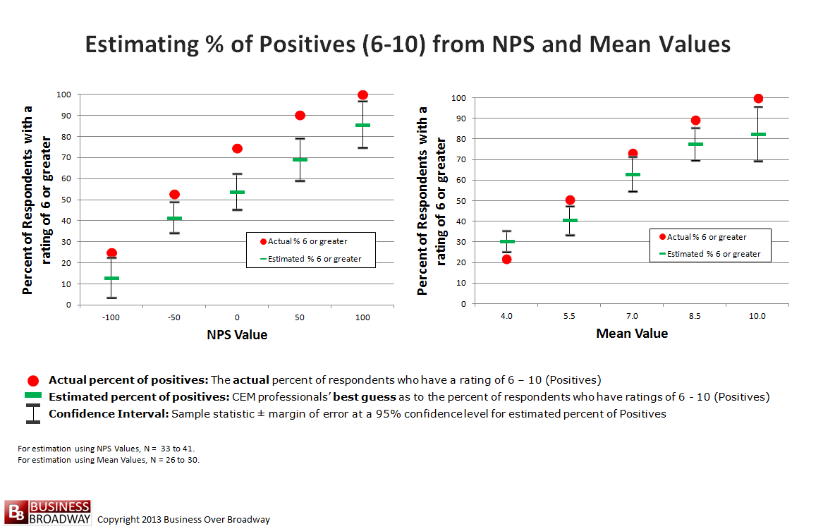
Figure 4. Estimating % of Positives from NPS and Mean Values – Click image to enlarge.
Generally speaking, better decisions will be made when the interpretation of results matches reality. We saw that a mean of 8.5 really indicates that 64% of the customers are very satisfied (% of 9 and 10 ratings); yet, the CX professionals think that only 45% of the customers are very satisfied, painting a vastly different picture of how they interpret the data. Any misinterpretation of a performance metric could lead to sub-optimal decisions that are driven more by biases than by what the data really tell us, leading to unnecessary investments in areas where leaders are doing better than they think they are.
My advice is to consider using a few metrics to describe what’s happening with your data. First, Mean Scores and Net Scores are equivalent. So, for trending purposes, pick either and use it consistently. Second, report the size of specific customer segments (e.g., % Top Box) to ensure people understand the true meaning of the underlying data.
With the shortage of data scientists to help fill analytic roles in business, companies are looking for ways to train existing employees on how to analyze and interpret data. In addition to training the next analytics leaders, businesses need to focus on educating the consumers (e.g., executives, managers and individual contributors) about data and the use of analytics. The current sample used professionals who have a high degree of proficiency in the use of metrics as well as in the application of those metrics in a formal company program. Yet, these savvy users still misinterpreted metrics. For data novices, we would likely see greater bias. If you are a metric-rich company (and who isn’t?), consider offering a class on basic statistics to all employees.
Some Big Data vendors hope to build solutions to help bring data science to the masses. These solutions help users gain insight through easy analysis and visualization of results. For example, Statwing and Tableau provide good examples of solutions that allow you to present data in different ways (e.g., means, frequency distributions), helping you communicate what is really going on in the data.
Remember that metrics don’t exist in a vacuum. They are interpreted by people. We saw that people are biased in their understanding of the meaning of two commonly used customer metrics, the Mean Score and Net Score. Carefully consider how you communicate your results as well as your audiences’ potential biases.


Fortunately, there is some light at the end of the analytics proficiency tunnel; and, it is coming from the academia arena. Sent your blog to my colleague, Professor Matt Liberatore, who heads Villanova University’s Center for Business Analytics. He replied that, within Villanova’s MBA program, they are providing some training on analyzing data, first through the required statistics course, and then through a series of analytics electives.
Michael,
Thanks for sharing my research with your colleague. With the explosive growth of data, data literacy is an essential skill in any profession. Understand data and you understand the world.