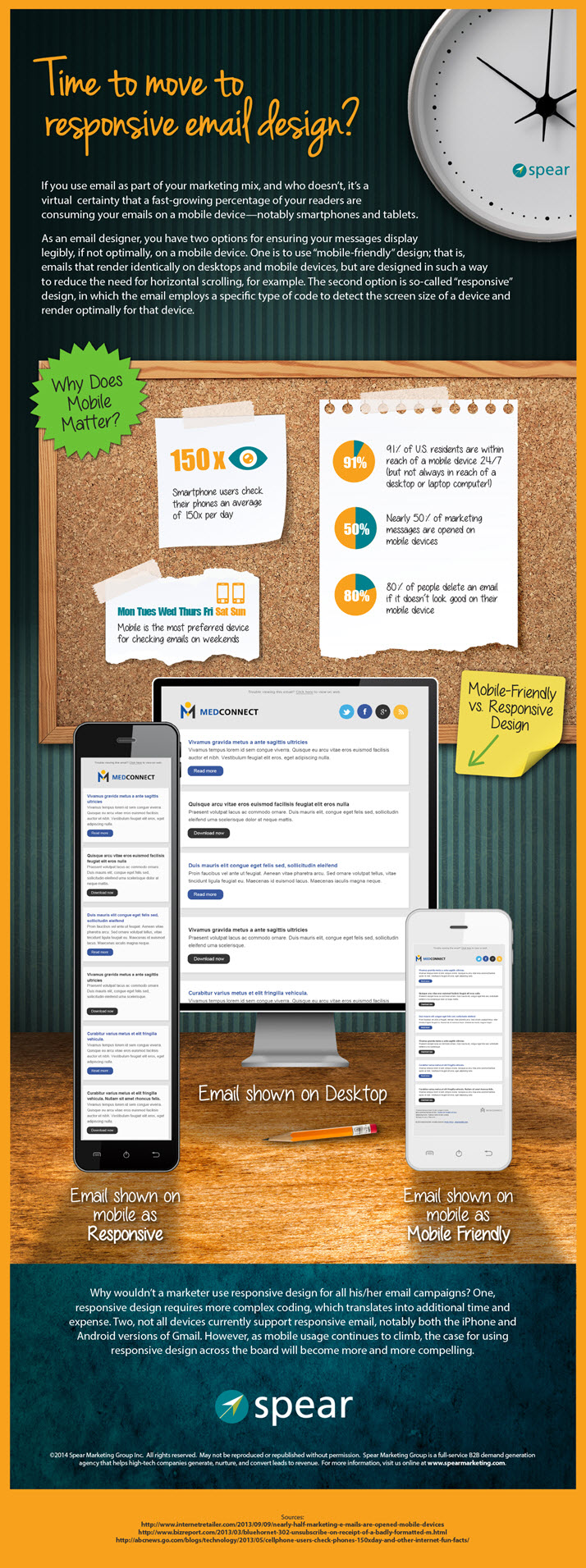
As mobile devices continue their torrid growth in the business world, B2B email marketers face a dilemma: is it enough to make emails “mobile-friendly” – in a way that at least renders those emails legible and easy to read, or should they go the extra step of programming emails to be “responsive” – designs that adapt automatically, and optimally, to the viewing device, whether mobile or desktop.
It’s not hard to imagine a time, probably in the not too distant future, when all marketing emails will be responsive by default. Today, however, depending on how mobile-centric your audience is, and given the additional resources, skills, time, and cost involved in responsive design, the decision to “go responsive” isn’t a slam dunk.
The infographic below illustrates the differences between mobile-friendly and responsive designs from the perspective of the reader, and highlights the trends driving us towards a world of email marketing that is dominated by mobile devices. Click on the infographic to view full-size.